Modern Masterpiece
by habituallychic
07 . 01 . 12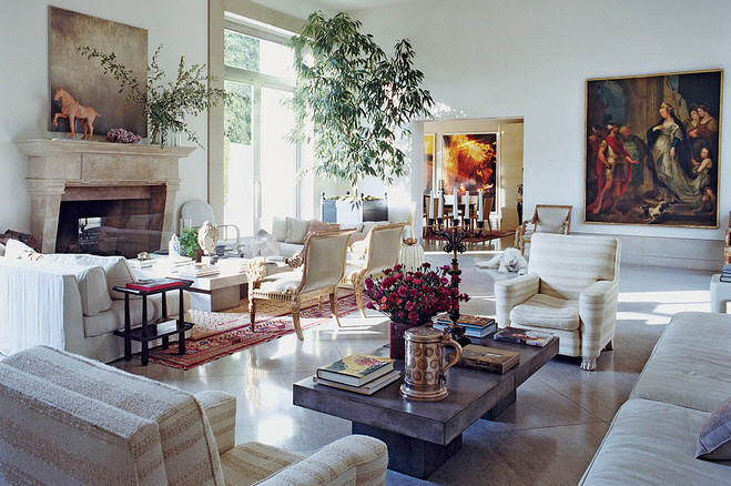
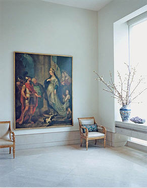
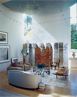
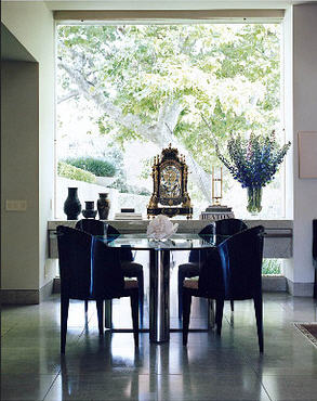
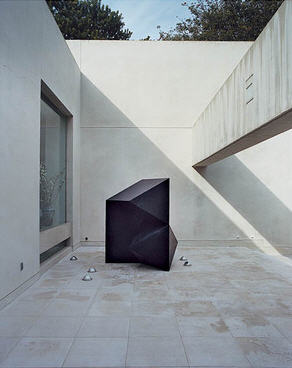
My biggest issue with modern and contemporary clean lined architecture is that people usually fill it with furniture of the same style. The best example I’ve ever seen of decorating this type of space is interior designer Michael S. Smith‘s new modern home featured in the Wall Street Journal Magazine this weekend. He’s filled it with a mix of antiques from his old Bel Air home and even a few new pieces from CB2. The new cement coffee tables from CB2 share the same space as Tang Dynasty horse purchased at Christie’s and an 18th-century painting among other things. Modern masterpiece indeed.
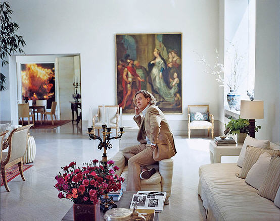
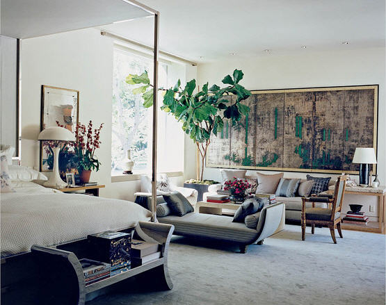
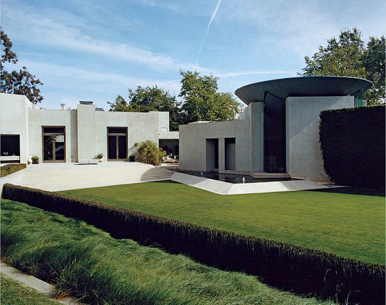
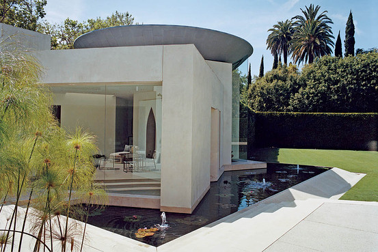
Photos by Francois Halard




8 Comments
I love how he mentioned the luxury that the volume of this space provides – and lucky guy to have a personal chef (that is my ultimate dream, I must admit).
It’s interesting that he chose the WSJ for this feature, versus the shelter magazines.
– Holly
Couldn’t agree more with the “filling the space” point you made. This home, imho, is done fab. I love the “mix”, I think it brings in so much more texture and lines to let the eye travel on. Thanks for sharing, I love it!
beautiful…I am a long time fan of the mixture of styles, though when it is done with perfection like this it can be made to look like a much easier process that it can be…the balance is delicate and he nails it! I could get lost in the amazing shadows given off ….alone
Those are huge space, yet they do not seem to overwhelm. Yes, he is definitely the master. Thanks. Mary
Stunning Heather; Michael has the ability to finely mix the modern and the ancient. One of the loveliest homes I have seen in some time. The art takes my breath away!
xoxo
Karena
Art by Karena
Does anyone know who painted the artwork featured in the living room? The composition and color choice recall a Renaissance work such as Vasari or Rubens
Love this! He manages to keep the home feeling warm and elegant, hard to do with modern style! Good use of color also! The dark art contrast well with cold mirror and stark lines! Thanks for sharing!
A lovely home, but I prefer the look of the old one. This one has a museum quality to it that does not have a welcoming feeling for me.
Best…Victoria