Designers at The Aldyn: Tahari & Malcolm James Kutner
by habituallychic
09 . 22 . 10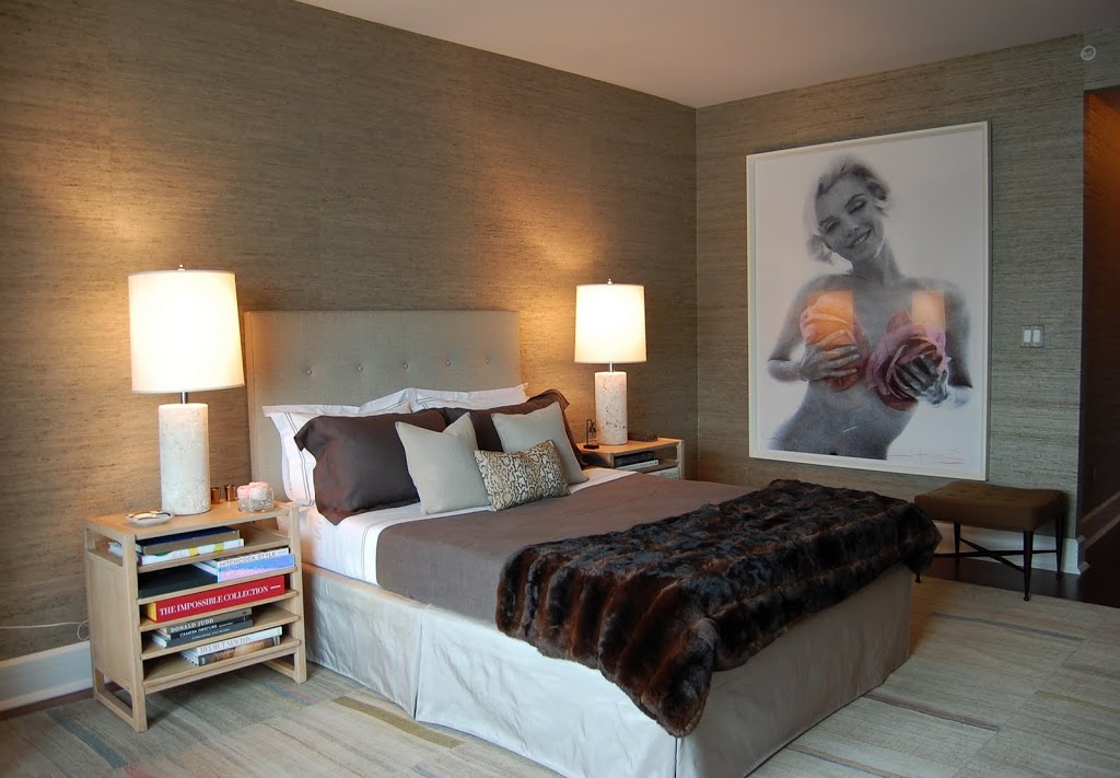
When I asked Malcolm James Kutner and Elie Tahari if they knew each other before they paired up for the American Fashion: Designers at The Aldyn showhouse, they replied they did not. Malcolm said it was like a blind date that actually worked out which we all know is a rarity. After seeing the master bedroom and gentleman’s study on which they collaborated, I’d say it worked out very well. Both spaces reflect the men’s shared inspirations of “timeless sophistication, unfaltering attention to detail, honest materials, and quiet elegance.”
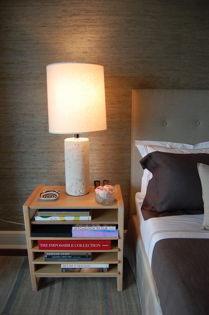
As I mentioned previously, I don’t love new buildings since they tend to be cold but Malcolm warmed up both rooms with natural grasscloth wallpaper from Phillip Jeffries. The palette was inspired by nature and feature grey tones, “ice-like silks and earth-hued linens.” My favorite piece in the master bedroom though is the vintage kilim composition rug from F.J. Hakimian.
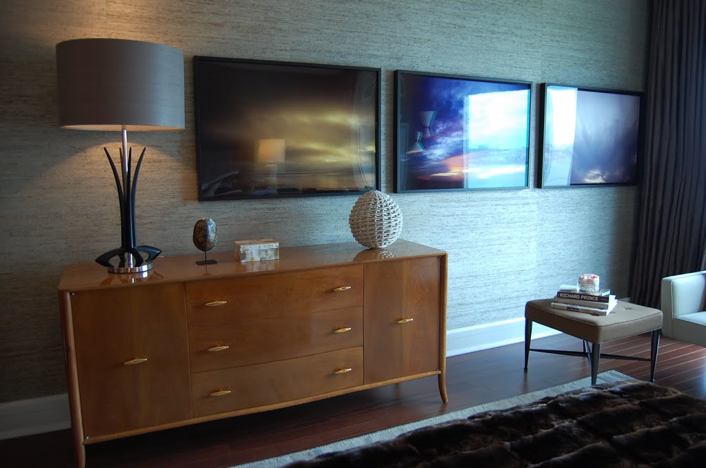
I love all the brass accents on the mid-century furniture in each room as well. Many of the pieces as well as the contemporary artwork is from Elie Tahari’s own collection.

Malcolm James Kutner and Elie Tahari

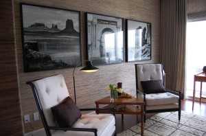
A detail of the bookshelves in the gentleman’s study.

Both designers insist on “form and function, style and grace, history and presence” and I think the room seamless blends these design sensibilities of Elie Tahari and Malcolm James Kutner perfectly. It’s too bad all blind dates don’t work out this well!

Photos by Heather Clawson for Habitually Chic


8 Comments
I LOVE masculinity of this bedroom. I could have done without the second piece of mid-century large bookshelves, but that’s just me. Everything else is sublime! I wish I could stand in the room and soak it all up!
Layers and Layers – they are two different rooms. The long dresser and bed are in the master bedroom and the shelves and chairs are in the gentleman’s study so not all the furniture is on the same space. Hope this clarifys things. Glad you liked the rest of it!
The first shot is dandy eye candy — the balance between the luxe textiles, sartorial details and statement art is absolute perfection.
thenerochronicles.blogspot.com
the spaces really do connect…I love the mid-century modern furniture! To me those pieces are timeless and still so functional..
Great post .. as always H.C.!!!
Have a Great Day! 🙂
i like the grass cloth and the chairs.
i am drooling over that dresser. it’s the perfect addition to this dapper space!
ps. we’re having a giveaway and would love for you to stop by! http://www.faucethead.com/blog/?p=1208
Masculine without being too drab. I love it! The pop of white lamps and art lighten the space while the yummy fur throw warms it up nicely!
The grass cloth and the carpets really make this work. Love the art in the bedroom!