Quirky Quadrille!
by habituallychic
08 . 24 . 09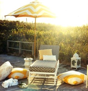 When I was searching for fabrics for my current big project, one of showrooms I visited was Quadrille. Turns out nothing was right for that particular apartment but now I can spot one of their fabrics a mile away! The showroom includes collections by Quadrille, Alan Campbell, China Seas, and Home Couture but are often all called just referred to as from Quadrille. Some of the fabrics look very similar so it’s often a little confusing but worth the hunt. They always look cheerful and it’s fun to see how different designers use them in their work. Enjoy!
The outdoor vignette above was one of my favorites from Domino and the Aga Reverse fabric from China Seas seemed like one of their favorites!
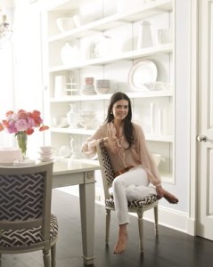 Domino used Aga Reverse in brown for the chairs in Katie Lee Joel’s chairs that made the cover. I think these were brought in for the shoot and not her regular dining chairs.
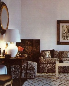 Probably the most well known of the China Seas fabric is Arbre de Matisse Reverse that was used in the room designed by Billy Baldwin for Woodson Taulbee. The print was inspired from the Matisse above the sofa. This photo was also used for the cover of Billy Baldwin Decorates and a print of it was used for the end papers .
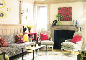 Jonathan Berger also used Arbre de Matisse Reverse in brown for this Brooklyn townhouse.
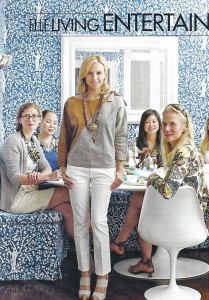 Tory Burch is seen in the September 2009 issue of Elle magazine in her breakfast room that has been swathed in blue Arbre de Matisse Reverse.
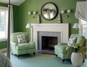 Designer Meg Braff upholstered a pair of chairs in green Arbre de Matisse Reverse.
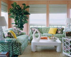 Alexis Beard’s decorators, Chiqui and Nena Woolworth, used a lot of Quadrille fabrics in her home including Nairobi in leaf on the sofas in the living room.
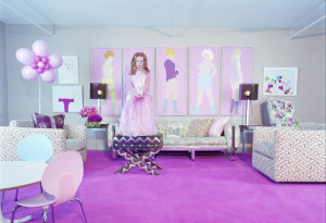 Amanda Cutter Brooks home was featured in the premier issue of Vogue Living and her living room features Java Grande by China Seas upholstery.
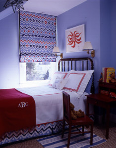 I love the graphic quality of the colorful Cap Ferrat fabric by Alan Campbell in Meg Braff’s son’s bedroom. There is a story in the Albert Hadley book about how he and Sister Parish were one of the first firms to use Alan Campbell’s fabrics. They were modern then and still look modern today!
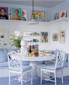 Aerin Lauder had a custom color Deauville fabric by Alan Campbell created for her kitchen in her East Hampton home.
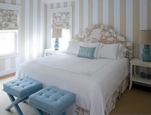 One of my favorite fabrics at Quadrille is Paradise Background and here Meg Braff creates a beautiful bedroom with it.
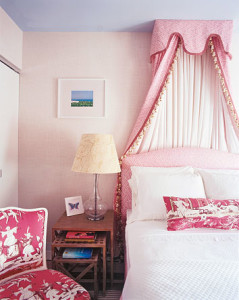 I’ve seen this fabric that Ruthie Sommers attributed to different sources but I’m pretty sure it’s Lyford Background by China Seas. I told you that sometimes the patterns get confusing!
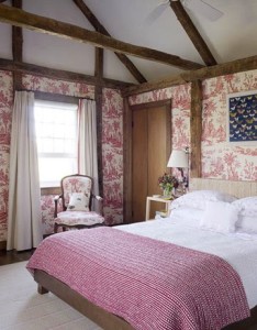 Tom Sheerer also creates a pretty in pink bedroom using Lafayette Toile.
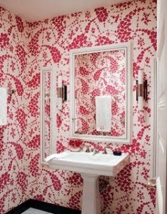 Jonathan Berger used another fabric from China Seas, Lysette in magenta, for a powder room in the Brooklyn townhouse.
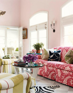 Carleton Varney, the king of color, also used Lysette in magenta but this time the reverse version. The pillows are also in Lysette in magenta and green.
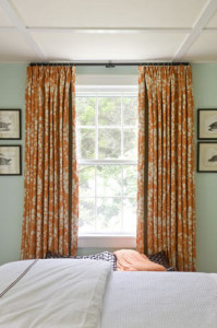 Although you can’t really tell in this photo, interior designer John Wiley used Lysette Reverse in orange for bedroom draperies.
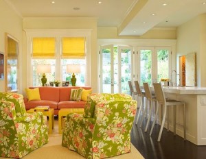 Another one of my favorites is Macao II by China Seas in Jungle Green which designer Palmer Weiss used for a client’s chairs.
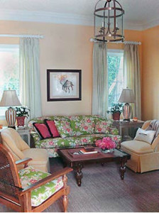 Here Macao II is used for a sofa and chair cushions by Brockschmidt & Coleman.
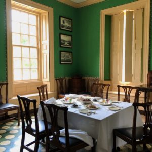
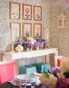 Ashley Whittaker created a beautiful dining room with Veneto by Quadrille.
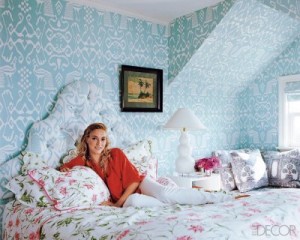 In Alexis Beard’s master bedroom, the wallpaper is Bali II while the headboard is upholstered in Bali Isle.
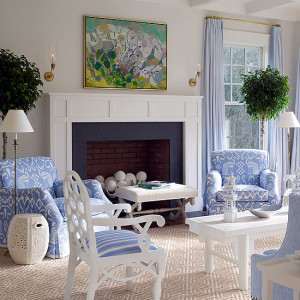 Meg Braff upholstered another set of chairs in Bali II in blue which looks great at the beach.
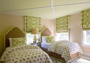 I love how the green Island Ikat looks on the roman shades in this bedroom designed by John Wiley.
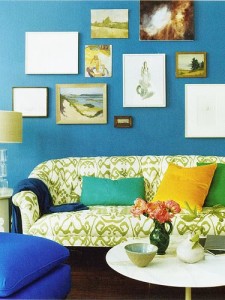 Domino really did seem to love Quadrille fabrics and used Bali Isle by China Seas for this sofa.
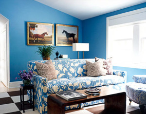 Once designers fall in love with fabrics at Quadrille, they tend to use the fabrics in various rooms of a project. Here Carleton Varney upholsters a sofa in Potalla Background by China Seas.
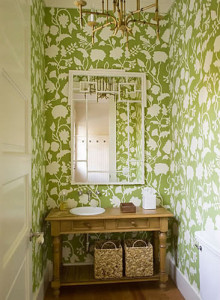 Meg Braff wallpapered a powder room in green Potalla Background by China Seas.
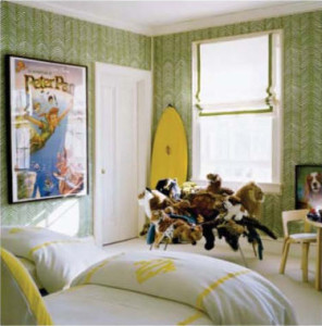 Aerin Lauder also seems to love the Quadrille showroom. Her son’s room is wallpaper ed in Zig Zag from Alan Campbell in green. She also had her outdoor furniture upholstered in Ferns by Alan Campbell when it appeared in Vogue Living but seems to be gone in the photos in the July/August 2009 issue of Elle Decor.


30 Comments
Oh Quadrille…they have some wonderful, wonderful prints! I’ve been completely in love with the reverse Arbre de Matisse since I saw it on/in Billy Baldwin’s book, and I was so happy when the Elle article on Tory Burch identified it. After seeing some of the other designs available from this company, I can understand why designers get hooked!
P.S.: I hope we’ll be seeing one of your projects in print soon … maybe one using Quadrille?!!
now, this is what i’m talkin’ bout! i LOVE this post, and i can’t wait to see the results of your new project! if none of the yum quadrille fabrics you’ve shown was right, i’m sure you’ve found something equally stunning.
i’m now going to dream of covering my sofa in china seas’ ‘bali II’ in orange! it would be loud and colorful, just like it’s owner…
and did i tell you i loved this post?
ps- how long did it take you to pull the images for this? i can’t even wrap my head around it!
Wow Heather – very comprehensive! Impressive post
Forgot about that in the DWP . . love that sofa!! All these rooms look great – I will have to remember this fabric!
Gorgeous post – these fabrics look amazing! Tracey xx
Oh! Beautiful fabrics!
I adore the fabrics Paradise Background and Lafayette Toile!
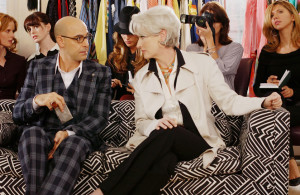
Nice that you have shown the image of “The Devil wears Prada”.
Have a nice day,
Greet
what a fab group of pics, and love that film Devil wears Prada! That’s all.
Quadrille has the best collection. Their colors and prints are just a bit retro, which I love. Hope to use one of the above soon.
Wonderful images and what a great roundup of all of these fabulous fabrics. super post.
I love the Quadrille collection as well. My favorite is Quadrille’s Veneto in Gold Metallic on Tinted Linen. Great post once again!
I adore Quadrille fabrics! Thanks for the great post.
Wasn’t the Arbre de Matisse fabric used by Billy Baldwin in Woodson Taulbee’s apartment originally created by Taulbee for his own firm, Woodson Wallpapers? The wallpapers came with matching fabrics, and as early as 1963, as reported in The New York Times, Taulbee’s bestselling pattern was Anemones, which was also adapted from a Matisse work.
Ahhh, we have long been fans of both Alan Campbell and China Seas here at DOXA! While not one to use patterns frequently, these are so incredibly fresh, in spite of their age (a testimony to good design), and have a great graphic quality to them, always fun to work with;) They work beautifully in both modern and traditional interiors and the fabric content is perfect for climates such as ours here in South Florida. Thanks for the post.
I wanted to pop in and thank you for inspiring me to start my very own blog.
Hope you’ll drop in and check my posts when you have a moment.
http://caftanchronicles.blogspot.com/
Is the Tory Burch fabric in Elle China Seas or “Fauve” by Clarence House? I have the same exact fabric in the same color but its Clarence House. If someone can make a clarifcation, I would appreciate it. BTW if somone wants to get thier hands on this fabric (well the Clarence House one) a seller on ebay is selling it for just $32.
Love the post & I am a huge fan of Quadrille.
All of the fabrics in the Quadrille family are gorgeous. I had a fun time attempting to capture “Veneto” when Ashley Whittaker commissioned me to paint that Southampton dining room for her. http://annechovie.blogspot.com/search/label/Ashley%20Whittaker
Great post, Heather! I hope you have a terrific time in Paris and I can’t wait to see your photos.
Olivia – They do seem addictive! I don’t know if I will be using Quadrille any time soon but you never know!
Maison 21 – you are too funny! I can’t wait to see what you choose from Quadrille! I’m sure it will be fabulous! Oh, I started this post a few months ago and kept coming back to it but when I saw Tory Burch in Elle, I knew I had to get it up soon!
Jessica – thanks!
Lindsey – they are definitely worth checking out!
Porchlight Interiors – thanks! Glad you enjoyed it!
Greet – Paradise Background is definitely one of my favs!
Annie – that photo seemed like the perfect way to end the post!
Brilliant Asylum – I think some of them would be great in your house!
Laura Casey – thanks!
Style Chronicle – I don’t know if I looked at the one in person. Sounds like something I would like so I’ll have to get a sample!
Sharnel – welcome! Glad you enjoy them too!
An Aethete’s Lament – you’re the historian so I guess you would know better than I.
Anonymous – I love seeing how they can work in so many different types of interiors! They really are great!
Caftan Chronicle – Great! Good Luck!
Anonymous – The article clearly stated that the fabric was from Quadrille.
Annechovie – I can’t wait to take a look! I’m sure it came out beautiful! I can’t wait to get to Paris! I am ready!
So pretty and chic! I have ripped out a lot of the same pictures in the past without noticing the common thread. I’ve never seen that Jonathan Berger bathroom before, though. I’m obsessed!
One of your best post ever! Great inspiration!
Love that you delved so far into your archives for this post…amazing!!! The very first day I set foot in Quadrille in the D&D I found myself shopping beside Jeffery Bilhuber and nearly died I was so star struck…haha, those were the days. Anyway, back to the showroom, with all it’s bright colors and whimsical patterns it’s such a pick-me-up, don’t you think?
XXX Kate “the NEO-trad”
WOW! this was a fun, enjoyable post! How DO YOU have the time to inspire us each and everyday.. FB, work…pack …you are one busy Diva!!
This is wonderful visual of these amazing fabrics, thanks so much for bringing it all together here. I want to use them all!
Great post!
Hi Heather, A huge compilation of great Quadrille-I am partial to the China Seas. Interesting how it all comes around.I did a post on Tory’s room last week,& I think this is about right as to the provenance of the le arbre-the star in the collection to my mind because of the BB connections-it was adapted from a Matisse as you said & according to an astute anon. comment from Courtney’s Style Court August 06 post about this fabric “”Its designer may have been Frederick Bradley, who worked for Woodson Wallpapers,the company that Taulbee founded in 1956(he died in 1974).I believe it is reproduced by Hinson & Company in NYC.”” Then HOBAC followed up with it is now in the Quadrille collection.(& MORE history) I have used the Fauve CH in a room in green- this doesn’t look exactly like it0 so similar,BUT- the colorway of the navy as it appears in the pics at Burch’s is not a stock colorway from Quad.(CH has a blue) I scrutinized it in several Elle pics- it might even be the black- 0r otherwise it was custom colored. G
This is a great post full of images that bring great fabric back to life in an “old is new” kind of way…Excellent info. Thanks!
Love this post and all these fabrics. I used zigzag in our family room mixed with lulu dk bolsters and happy how it injected some fun color in our otherwise calm color pallette.
http://teamfreas.blogspot.com/2008/11/dress-up.html
jennifer
China Seas is one of my all time favorite fabric collections! Always so modern & fresh. Love your selections.
heather, such a great post! so many of these fabrics are familiar to me and it’s nice to see them all together (and in various colorways!) thanks for doing the gruntwork and pulling this one together!
http://www.mylittleapartment.blogspot.com
In Meg Brag’s living room with the baby blue Bali II fabric, I looked on the China Seas site and the only blue they show is like an almost navy blue…do you know if the one in Meg’s is discontinued?
Quadrille is my favorite place for fabric and wallpaper. I thought the wallpaper used in Ashley Whittaker’s dinning room was San Marco. I might be wrong.
While searching for photos of Bali II, I came across this post. Absolutely a treasure trove of gorgeousness!
Thanks as well for the pic of the zigzag wallpaper – had not seen that previously in such a large space. Fun.