Jenna Lyons Home: The Complete View
by habituallychic
08 . 20 . 09 I don’t mind when different magazine’s publish the same home if they reshoot it and use different photos. I love seeing the changes a homeowner may have made and also with different styling. It’s fun to see rooms or areas that one magazine left out but another decided to shoot. So that’s why I was excited to see Jenna Lyon’s Brooklyn brownstone on the cover and featured in the September 2009 issue of Livingetc from the UK. I’m sure you all remember that Jenn’s home was also on the cover and featured in the November 2008 issue of Domino. Melanie Acevedo shot the home for both magazines and one of the cute things you’ll notice is that Jenna’s son Beckett has grown from baby to a toddler in the Livingetc photos! I also found some photos on the Levenson McDavid Architects website. I think the combination of all the photos gives you a really good look inside this fashionable abode! Enjoy!
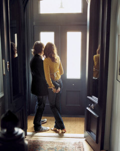 A romantic shot of Jenna and her husband in the entry that appeared in Domino.
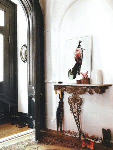 In the Livingetc photo Jenna mentions that the entry is painted in Off Black oil eggshell by Farrow & Ball. I love all the tiny little shoes lined up! So cute!
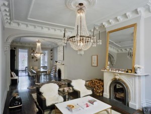 The architect’s photo of the living room gives you a full look at the room and all the way to the back.
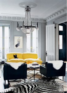 The living room as styled and shot for Domino. Love the pale grey walls and accents of black and yellow! In reality, the zebra rug is not layered on top of the other area rug.
 While the photo in Livingetc is correct, it was flipped for the cover. A painting on the wall was also removed for the text. Wonder if she’s wearing the Essie for JCrew polish on her toes!
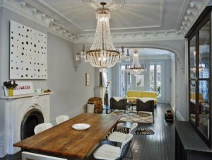 The architect’s view of the dining area. Now you know why magazines shoot tight shots or crop them!
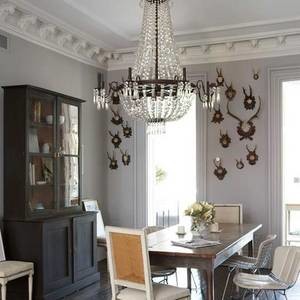 If you’ve seen the house tour video that Jenna and her husband gave to Domino, this is the correct layout of the dining room. I love everything about this room. It’s so interesting and personal.
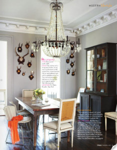 Here you can see how the room was styled for the shot that made it into Livingetc. You can see the photo was flipped. That sometimes happens because I photo looks better that way or works better with the fold.
 The Livingetc shoot was styled by Lili Diallo who we all remember from Domino. Love her!
  The architects shot of the kitchen is a little cold.
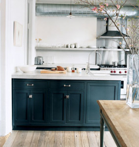 You can see how styling and flowers warm it up in the Domino shot.
 Jenna was shot in the kitchen for Livingetc. Love her green top too!
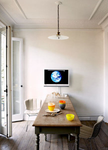 In Livingetc magazine article, the kitchen farmhouse table is shot with Jenna’s husband Vincent Mazeau and their son Beckett. The online photo is just the table.
 A cute little dinosaur vignette on the kitchen table.
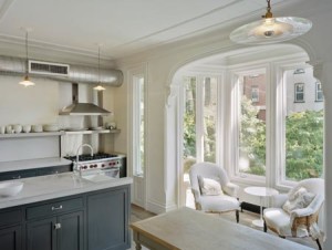 The architect’s view of the bay window.
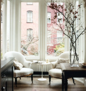 The bay window in one of the online shots from Domino. I love that they kept the chairs very natural.
 This shot of Jenna and her son appeared in Domino. Melanie Acevedo took a lot of sweet family shots!
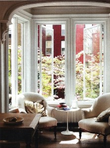 I think Livingetc flipped this shot too since now the table is on the left! But the flowering trees look pretty outside the window!
 The view of the backyard with the flowering dogwood tree is my absolute favorite shot from Livingetc! It’s so beautiful!
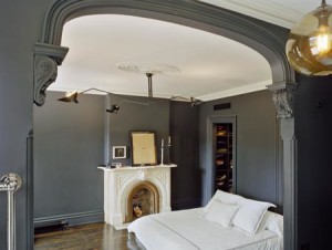 The architect’s view of the bedroom makes the walls look grey but it’s really black chalkboard paint. You get a good view of the Serge Mouille light fixture though!
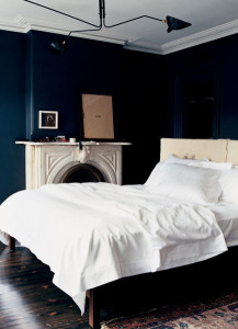 For one of the domino shots, they added a headboard and left the linens plain white.
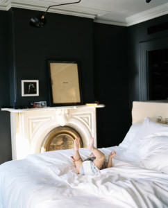 A cute shot of Beckett playing on the bed!
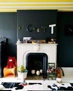
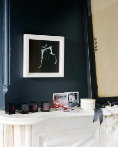 A close up of the styled mantle.
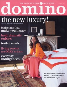 The room as seen on the cover of Domino now with Olatz linens!
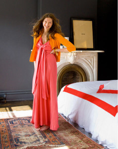 A different shot had Jenna standing instead of sitting.
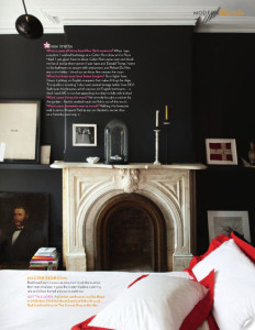 I love the artwork that was seen in the Livingetc shot.
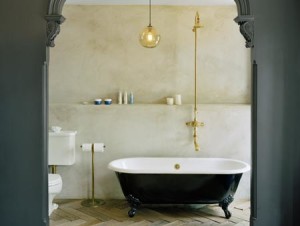 In the architect’s shot, you see the toilet. Not usually something that magazines tend to publish unless it’s a specific story on bathrooms.
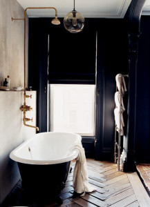 The bathroom as seen in Domino that made everyone want a black bathroom with brass fixtures!
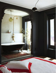
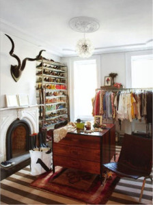
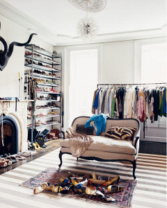 Everyone also loved the dressing room with the French settee. A entire room devoted to your wardrobe is everyone’s dream!

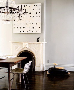 The dining room as shot for Domino. Love the car by



55 Comments
What a great post! So interesting to see how they move things around and how much styling and great photography affect our perception of the rooms!
Wow! I REALLY enjoyed this post! I was so interesting to compare pictures and get more of a perspective into how a room is actually laid out and decorated as a whole. Also great to see how good styling really helps the feel of a space. Loved seeing the changes over time too!
i adore this post – Jenna’s home, life, style, everything is fabulous. such an inspiration!
xox
Amazing mouldings!
Very interesting comparison! It’s fascinating to see how different photography eyes look at the same space.
fascinating! and I’ve admired pictures of this home for a while, so fun to see more!
To me- her home is perfection. Modern and chic. I love how you compared the articles and images- thanks!
It’s not enough that we have photoshop to airbrush models from size 2 to a size 0 and remove every line bump mark hair, elongate them so they have legs that appear 6 feet long and 2 inches wide now I have to deal with the fact that they style the heck out of houses? Not only do they flip flop rooms, they add furniture and I noticed in one shot removed an air vent from in the kitchen. I will never measure up if I can’t see reality. UGH!! All that said I still love seeing the shots. Thanks, MB
Thank you for this post!! I adore Jenna Lyons so this was especially fun for me.
What an interesting post. Like many people, I really fell in love with this home when I saw it in Domino. So to see it from other angles and replaced with different decor elements in the Livingetc piece was quite fun. Still fabulous though.
Thanks for the interesting insight into how rooms are photographed. It’s amazing what some flowers and a cutting board can do to make a space feel more lived-in and inject it with some personality.
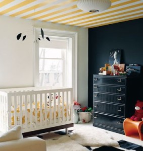
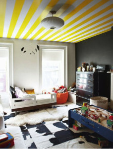
Love the herd of sheep congregating in little Beckett’s fireplace, too!
I love this home. I always wonder how it is in person with the chalkboard paint. Lighting in photos can be deceptive. The babies room is my fav. Love the ceiling
great post!! i also found it fascinating to see the differences between photographers and sytlists. thanks for this – love your work.
LOVE EVERYTHING!! Anyone knows the paint color used in her livingroom/dinningroom?
What a gorgeous home! Love your comparison post! Tracey xx
Such a beautiful house, however it’s styled. It’s funny how different it looks (the mood that resonates) based on the source of the pictures. In each of the 3 pictures of the master bedroom, the paint looks completely different – one looks gray, one looks dark blue and one looks black, which all goes to light and lighting I guess! Thank you for sharing and comparing!
Great post! It was really interesting to see the different takes on the home! 😀
wow super interesting post. I remember this home from Domino (a magazine I genuinely miss…), and it’s fun to see how these rooms are styled!!
Removing a painting, moving carpet’s places… they change so much stuff!!
But the best is that they flip pictures!! Never thought about it but it’s very interesting to know…
For months I have been wondering why I wanted to paint my bedroom an insanely dark colour and for months I have been wondering where and when the idea popped into my head…. It was from this home shown in Domino! Loved the bathroom with the black bust especially the Parisian style floors which I dream about. Your blog is fabulous!
Joanna
Very interesting post. I learned so much…..
tres’ chic!!
Thank you for bringing these photos to your readers — enjoyed this post so very much!
oh such a great post! It’s amazing how much difference can make a good photographer view!
have a wonderful weekend!
Love the high ceilings of classical houses…I do have issues with the extensive use of white walls in British houses…That pale white light can have a fish bowl gloom at times…I do so enjoy a lively yellow…Rooms really pop…
That was my favorite ever issue of Domino! After seeing this post I may have to dig it out!
What an interesting post, thank so much! I loved the layout when it cam out in Domino, actually tore the living room shot out and filed it;) Love the gray and yellow combo offset by the graphic zebra skin along with the beautiful chandelier. Thanks for the insight into how the shoots are styled and coordinated.
thanks for sharing this!
Wow, what a beautiful home and beautiful woman ! Looks like a very happy family !
And what a great post that rounds the picture up !
Loved this post! Stunning pictures…
So fun to see more of this house. I still love that black trimmed entryway.
Probably my favorite house ever (sadly I carry around that issue of Domino likes it’s the Holy Grail). I painted two of my bathrooms in chalkboard paint after seeing the Domino article.
I love!! seeing the results of the same house from different photo shoots.
Now I’m off to get Living, Etc.
Thanks for a great post!
I’m so envious of Jenna Lyon. What a remarkable change she has brought upon J.Crew in the last few years. She turned that company around! Anyway, no doubt about it, Jenna’s got an eye. I loved it when Domino featured her home, and I came across the Living Etc article just days ago so I love seeing this post.
FYI, I’m not a photo stylist, but I have a friend who does it and I have a deep respect for people in the field. I’m always trying to explain the work to my friends and I’m not sure anyone gets it. Now I’ve got something to show them. Thank you!
I didn’t relize that so many of my favorite file photos were from the same house. Loved reading all the photoshoot background and seeing the layout changes of this fabulously personal home. Is it really bad to say I loved her coral dress? Sorry, I know that wasn’t the point of this exceptional post but it looks so perfect on her!
Thank you for posting more pics of her home! I didn’t see Domino’s article but was drooling over those pictures of chandeliers in Livingetc and even posted about them on my blog too!
Have fun in France!
Irina
I absolutely love your blog. I’m not sure I’ve ever commented before, but I really enjoy the behind the scenes look Habitually Chic provides. This is a fascinating post, so interesting how the photo angles make their home look so much different! Thank you for sharing!
So grateful for the time and effort you take into putting together your posts! You are definitely one of my favorite interior style bloggers, thank you.
Jenna’s styling for J. Crew is fantastic. No surprise her house is exceptional.
I wonder if she had to import the backyard Dogwood or if it was always there.
I don’t think the darkest paint color is chalkboard. I’m going to guess it is Railings by Farrow & Ball.
ANNA
What a great post, thanks! The house is beautiful however its styled…
and those crown moldings… bold and amazing!
A great post! I enjoyed seeing the comparisons of architect’s shots and Domino’s. What a difference a different set of eyes makes (especially the kitchen and the bedroom)! Domino just had a way of romancing every room.
I’m so glad everyone enjoyed this post! I don’t have time to respond to everyone individually but I did find that they grey paint is Coventry Gray (HC-169)from Benjamin Moore.
Jenna also stats in both magazines that the bedroom paint is Chalkboard paint. Paint can look very different in photos than in reality so keep that in mind.
what an INCREDIBLE post! I love this home, and it’s so awesome to see such a complete collection of photographs. Thanks for posting all of them!
What an informative post!! I had seen both magazines but thank you for all your info re flipping etc. Another Domino home that’s been published more than once (more than twice maybe) is Ruthie Sommers’. That also serves as a great case study for styling, magazines and how our homes change organically.
I Love the black and white combo – another example is the apartment of designer Alexander Wang ( from Domino mag ). I just recently postedit on my blog as well. It’s a stunning combination of cremes and whites, with vintage and modern pieces together. . I love it!
Wow, I did not realize that they made such huge changes to the homes for shoots. I think I might be offended if they wanted to change things in my home…I’d wonder why they were there in the first place. Great post!
Such a fantastic house!
It was interesting to see the difference that the styling and photographer make.
So inspiting… Im in LOVE!
Interesting to see the changes made from architecture shots to magazine shots. Same thing that happens to models/people happens to houses, I hadn’t thought much about that before.
There’s a floorplan? How do we see the plan?! 🙂
I LOVE this article – thank you for sharing some “insider” tips!
I realize I’m a little late to the party, but I had to say I loved this post. I haven’t seen the images from Living etc. and your commentary is informative and interesting. While I have heard of Jenna quietly before, in the past few months she’s (for me) become very noticeable.
Thank you – fantastic post again.
Great post. I loved seeing the differences in the photo shoots. Jenna’s home is just the perfect amount of minimalist.
This is great! I love the behind the scenes look at the styling & shooting. Great post!
My dream house looks pretty much like that! Someday…
this is one of the best posts i’ve ever read! so thorough and interesting (and of course the space is unreal). thank you for gathering all of these pictures into one place!