Hamptons Designer Showhouse: Rooms by Katie Ridder
by habituallychic
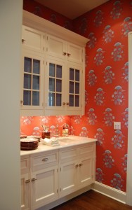
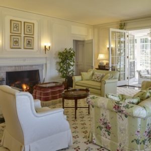
07 . 30 . 09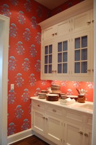 Sometimes it is the smallest rooms in a showhouse that make the biggest impact and that is definitely the case with designer Katie Ridder‘s butler pantry and bathroom in the Hampton Designer Showhouse this year. She is lucky that she had her own great line of wallpapers to choose from but how many people would really wallpaper a butler’s pantry in real life? Usually they are such a small room that they get overlooked in the design process but with this bright cheerful paper, it becomes a jewel box.
 One of the other designers in the house mentioned that she at first felt sorry that Katie Ridder got such small rooms but clearly she managed to do a lot with the wallpaper and accessories.
 When you walk down the hall, the room makes you smile as you walk past it.
 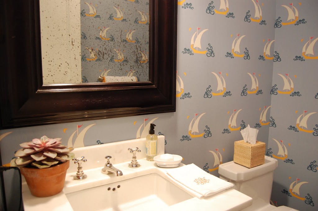 It’s hard to photograph powder rooms well but you can get a sense of how cute the sailboat paper looks in a house by the beach! Small rooms are great places to make a big impact with wallpaper and take chances with pattern because there is less of a chance of a homeowner getting tired of the design since they see it in small doses.
Photos by Heather Clawson


17 Comments
thanks Heather, for your endorsement! I love you blog.
Katie Ridder
* TERRIFFIC COLORS on that wonnnderful wallpaper in the Butler’s Pantry!!! (It’s SOOO “happy & welcoming” that I think I’D VOLUNTEER to be THEIR Butler (“-ess”!)… Grins!
Nice way to start the day! Thanks!
Linda in AZ *
Beautiful paper selected for the pantry, makes me rethink how pantries have been handled – all white – over time…
Love the wallpaper!!
x me
Terrific butler’s pantry, utterly cheerful and luscious colour. Katie is brilliant.
The butler’s pantry is amazing. She created a showstopper without sacrificing an ounce practicality.
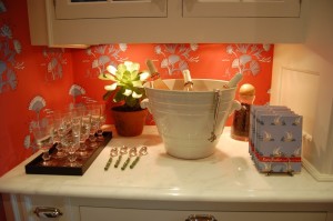
Almost as much as the wallpaper itself, which is beyond faboo, I love that she carried the blue of the wallpaper into the cabinet by placing a solid swatch of color behind the glass. Simple idea, but it really keeps the eye moving and breaks up the whiteness of the cabinetry.
LUV IT!!!
you’re so right! in a way, the wallpaper almost expands the spaces and also draws you in, forgetting that it’s tight quarters 🙂 that sail boat paper is so fun too!
The return of wallpaper – I love it!
I love it.
We always had, and only ever had, wallpaper in the hall bathrooms. The powder rooms. Except in London, where anything got wallpapered if it stood still long enough.
I love the fresh pop of wallpaper, especially in a powder room or a butlers pantry!
Love the butler’s pantry… the paper in the powder seems a little busy to me… but..then again..I don’t enjoy a house on the beach!!
I love the sailboat wallpaper! Perfect for a beach house.
Love this!!!
That red/orange wall paper was divine. Thanks!
I’m loving this wallpaper…, and a powder room is the perfect place to go a little bit wild.
I love the freshness of the sail boat effect too!
Yes on wallpaper in powder rooms!
I love the impact every time I use it and today the industry has to offer sooo much!