Kips Bay Decorator Show House 2008
by habituallychic
04 . 28 . 08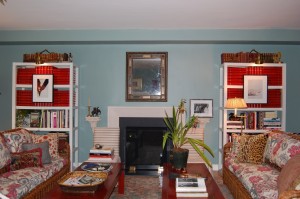 I had the pleasure of visiting the 2008 Kips Bay Boys & Girls Club Decorator Show House today and was blown away. This year’s Show House was only the third time in 36 years that the “house” was shown in an apartment building and not a townhouse but I have to say I loved it. Most New Yorkers live in apartments and not townhouses so the designs are easily translated to city living but are also easily translatable to real homes. I attended with my colleague Kristen and we were inspired by many of the designers and took notes on ideas we want to incorporate into the homes of our clients. If you live in New York, you should definitely check it out for yourself but if you can’t make it, you can see some of the great designs here. Enjoy!
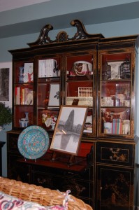 The Show House encompasses six apartments on two different floors and the roof. First up are the rooms from Charlotte Moss entitled “Room Service” which include a casual wicker seating arrangement in the blue living room and also a little dressing room/office. The living room even includes the famous red leather bound issues of Vogue that belong to Ms. Moss.
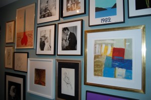 In the entry hallway, were beautiful framed art and photography.
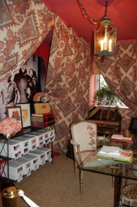 The Charlotte Moss designed dressing room/office included shoe boxes with Polaroids of their contents, vintage Louis Vuitton luggage and room to write.
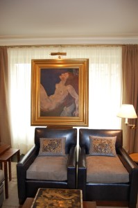
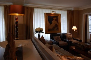 The living room of apartment one is by Steven Miller Siegel Architects and was stunning. Much of the furniture was custom designed by the firm including the sofa, club chairs, dining table, easel, and floor lamp. Other pieces were by Leleu and Ruhlmann so you know this was an amazing space!
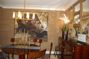
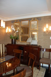
 I couldn’t find a source listed for the outdoor dining table and chairs but it perfectly fits the small terrace off the dining area.
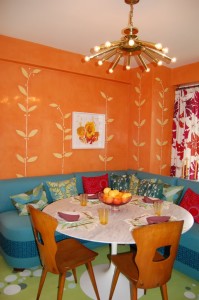 Sara Bengur Interiors designed “The Orange Room” which includes a kitchen, dining area, and terrace that looks perfect for a young family.
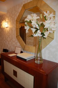 One of my favorite designers included in the Show House is Sara Story who designed the foyer above entitled “A Graceful Approach” that includes a beautiful console and mirror by John Himmel at John Rosselli & Associates. The patterned wall covering is from Dedar.
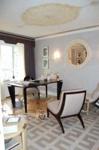 Sara Story also designed one of my favorite rooms, the “Harem Den.” Sara said she intended it as a “home sanctuary for a strong, independent and successful woman.” As someone who doesn’t like overly frilly or girly rooms, this space resonated with me. The lion belonged to her grandmother, who was a big-game hunter, and added a “don’t mess with me” vibe that I loved.
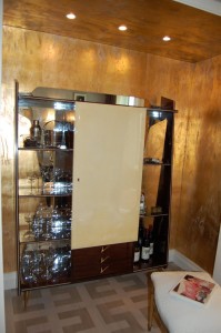 Sara also says that “women are so much more than a closet full of shoes” and this is evident by the stocked bar in the Gio Ponti credenza, obviously intended to serve the woman and her friends who she saw hanging out in this room.
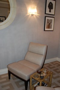 The walls in the room are grey Venetian plaster and the floors are stenciled in a Swedish style. I usually don’t love Venetian plaster because it’s very hard to get right but many of the rooms in the Show House incorporate it and are all done beautifully!
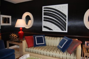 Jeff Lincoln Interiors designed the “Den/Study” with walls that lined with corrugated cardboard that has been painted a shiny brown, an interesting and original idea.
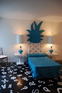 One of my least favorite rooms was designed by Ellen Ward Scarborough and Pariscope Design and is entitled “Jewel Box.” I feel bad saying it but next to all the luxuriously and professionally designed rooms, it just looked a little cheap, especially since it wasn’t designed as a child’s room.
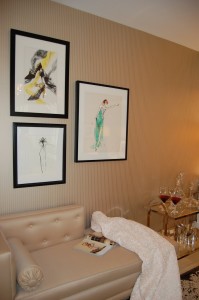
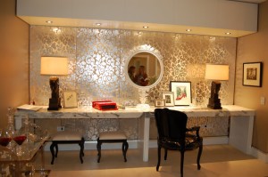 “Scarlett’s Dress” was designed by Cetra Ruddy, a firm I have never heard of but whose design I really enjoyed. The room looked like a luxurious sitting room for a glamorous woman. The marble built-in desk/vanity and wallcoverings from Roger Arlington were stunning in person.
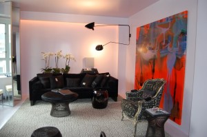 Another design firm I have never heard of is BKH (Burley, Katon, Halliday), a Sydney design firm with over 30 years of experience that is opening an office in New York this year. The walls and floors are all high gloss lavender but there is nothing girly about this room. The black accents give it a very sophisticated edge and the mirrored screens near the windows reflect the light wonderfully! I will definitely be looking out for more from this firm. I just wish their website wasn’t so hard to navigate!
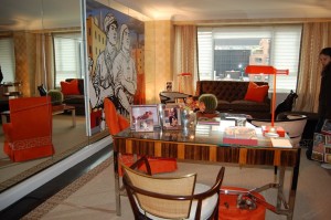 Interior designer Geoffrey Bradfield is a legend in New York and his “Art Dealer’s Bachelor Pad” was of course, beautifully designed. I loved the burnt orange Venetian plastered walls that were so slick they looked like lacquer.
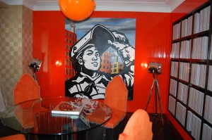 I also loved the wall of shelves that held magazine holders. When I design my own home someday, I’m going to have to remember this wall that would be perfect to hold many collected design magazines. The only thing I would have changed in this room was the art. Personally, I would have preferred paintings that were a little more abstract and perhaps not so jarring. Other than that, I love the space.
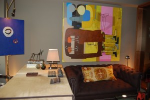 Another fun men’s room was the “Tailored Urban Study” by William McIntosh Design.
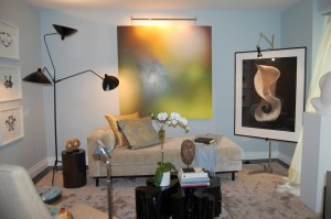 I really love S. Russell Groves design style and his room entitled “Dream State” doesn’t disappoint. I don’t think my photo does justice to the therapist’s office that “belonged to the patient and not the therapist who actually made housecalls” to the homeowner. The framed Rorschach test inkblots on the wall are a cheeky touch and actually look like chic art!
 There were only a few bathrooms open at the Show House and the one designed by Webb White as part of their spa like bedroom suite was especially zen and gorgeous!
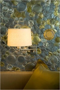 Webb White designed a beautiful bedroom that I wish I had a better photo of because the bed looked so inviting on a grey day in New York. The wall behind the bed from far away looked like patterned wallcovering but up close you can see that it’s made from metal tops from cans. The installation was created by artist Clare Graham who the designers commissioned furniture from in the past. This room alone is worth visiting the Show House to see!
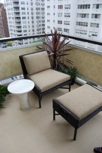 The terrace outside the White Webb room features the same floor covering from Patterson, Flynn, Martin as the bedroom and a beautiful fabric screen on the railing. The outdoor chairs and ottoman are from McGuire.
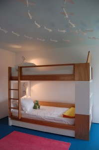
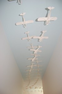 The hallway leading to the little boy’s “Wing Room” by Truck Product for Nurseryworks is lined with wooden airplanes suspended from the ceiling and wrap all the way into the room below.
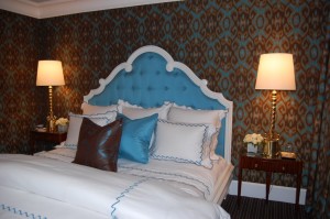 Larry Laslo Designs not only designed a huge living room but this pretty ikat lined bedroom and a bathroom.
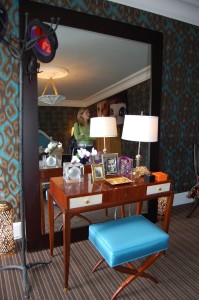 I love the little vanity and stool but I can’t find a source for it.
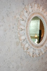 The shell mirror in the bathroom that Larry designed for Walker Zanger was very pretty, as was the mosaic wall in calacata marble.
 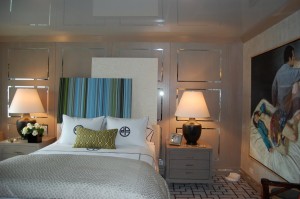 One of my all time favorite interior designers is Philip Gorrivan and his “Quiet Time” bedroom and sitting area was beyond chic! My favorite feature is the stretch vinyl ceiling called Extenzo that looks like lacquer but costs far less. The ceilings in the apartments are 8 1/2 feet tall and obviously Gorrivan is a pro and knows that a reflective ceiling makes the space seem taller. It is a great trick that great designer in New York have to incorporate and it looks perfect here. The seams are barely visible as well.
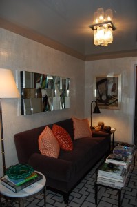 I don’t think this photo does the sitting are justice. It was perfect for the space and actually looked like you might sit there and read a book.
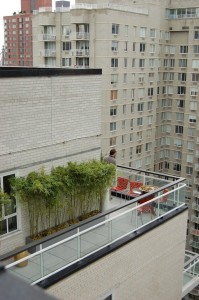 The view from the roof to a terrace below.
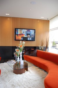 The area on the roof is known as the Manhattan Club and can be used for parties by the residents of the building. During the Show House, Vladimir Kagan has a huge installation of furniture and original drawings. Also, on Tuesday, May 13th from 6-8 p.m. Vladmir Kagan will be signing copies of his autobiography, The Complete Kagan: A Lifetime of Avante-Garde Design.

The view from the roof garden of the Kips Bay Decorator Show House is just as spectacular as the designs below and I hope that you make a special trip to visit it. All the proceeds benefit the 14,000 young members of the Kips Bay Boys & Girls Club, a very worthwhile cause in New York. I would also like to thank all the wonderful designers and volunteers who made it all possible and who were kind enough to let me photograph it for you!




27 Comments
Hey- just got in from dinner and too much of a great Stag’s Leap Cabernet! Love seeing the Kips Bay house. I don’t have to be there – can just check out your blog. Funny to see Larry Laslo’s bedroom. I worked with him years ago when as a favor to my ex-hubby (who was out of the country on a job) my brother and I built a set in Bridgehampton to shoot some bedroom scenarios for Waverly that Larry was working on. He was a sweetheart. We stapled pink toile to the walls and had vases full of white cosmos!
Fantastic! Thanks so much for sharing! BKH are super famous in Australia – there is a new book out on their portfolio by Phaidon if you’re interested.
the can wall is AMAZING! it looks almost organic, like malachite, and i need to find out more info on extenso, as lacquering a ceiling is so labor intensive (read $$$). thanks for the picutres and th tip on extenso!
as far as that pineapple headboard twin bed monstrosity- WHAT were they thinking?
Marie Louise, What a fun story. Larry Laslo seems like a character.
Thanks Suzy! I will have to check it out. I think it’s very exciting that they are opening an office in NYC. I’m glad the Show House has exposed us to so many new firms too!
Maison21, Gorrivan said the Extenzo cost $4,000 as opposed to the $25,000-30,000 for lacquer! I also think that since it’s stretched over the ceiling that it might hide imperfections instead of exposing them.
this will take me a week to paruse all of these firms… you never disappoint
HC-almost didn’t want to look because I think I’m going to make it in, but glad I did cause it only motivates me more to take the drive! Terrific pics!
Lissa, Even I want to take a closer look at everyone’s websites when I get a chance! They are all so talented!
House & Life, Oh, there is plenty more to see! My photos just give you a little snippet of each room. I also missed photographing Larry Laslo’s living room, the amazing room designed by Andrew Edward Kepler Design & Interiors (check out the before and after photos there), and many other little amazing spaces. You’re going to love it!
The lacquered corrugated cardboard technique was shown to great effect in Nicholas Haslam’s 2002 book Sheer Opulence.
I must be very in touch with my feminine side as I’d like to hunker down in the Harem Den myself! The living room is fantastic, too. The can wall has a deco feel. I wonder how it would work as a fireplace surround?
the harem den is a knockout although I’d feel weird about the animal head (a regular headless- hide would be less intense and more suiting for me!)
I also love the scarlett’s dress- very opulent!
thanks for taking so many pics for us!
Your blog is one of my favorites – Excellent posts every day…Thank you! I am in love with the white planter on the terrace holding the hydrangeas – Love them. Anyone know a good, well-priced source for planters (indoors and out)? Thanks!
Anonymous, I’ll have to check that out. Thanks for the tip.
Easy and Elegant Life, all the designer were even better in person. I want to move into the Harem Den it’s so fabulous!
I loved the can art but I would have figured out a way to rub off the printed on expiration dates. But that’s just me.
Jessica Claire, I grew up next to a neighbor with my animal skins and taxidermy heads so it doesn’t even phase me. You could achieve the same effect with a headless version though.
Thanks CCS! I’m so glad you enjoyed it. While I’ve was sourcing outdoor furniture all last week, I have yet to look for planters. I feel like you could get plain white ones at Tar-jay or even Ikea and no one would even know since the plants would cover. I’m not sure where you like but upper Lexington Avenue has a million garden shops you could try. Ok, maybe not a million but certainly a lot!
Impressive! Thanks for the post… I like all of them… I really really loved it… Now i have more ideas for my living room..
Keep it up!! 🙂
Wow – looks like some great ideas – I love the little planes!!
The pineapple bed is just awful. The room looks so bad compared with the other rooms. It looks like a child’s school project.
The framed sketches (or water colours) in the “Scarletts Dress” room by Cetra Ruddy are lovely. Do you have any idea who the artist is, or where I can find out?
Fabulous! Thanks HC!!
I visited the show house yesterday and loved the stretch vinyl ceiling by Philip Gorrivan – so clever, effective and unusual – and I think I am the only one, but I liked the room by Ellen Ward Scarborough and Pariscope Design – it was fun, fresh, alive and it made me smile –
I’m so glad you covered this. The NYT only covered it from one angle.. so it was great to see and read your take on the Sara Story room and others.
I think the shift to apartments is much more realistic, even if it does seem to undermine the spirit of the show.
Nice detail work. Thanks for offering more detail 😉
Wow! Thanks so much for bringing to the rest of us who can’t be there a fabulous tour of the showhouse. Some pretty amazing rooms!
Karen
Great huge post! I love the orange dining room designed by Sara Bengur and the can lids on the wall from Webb White. I had to take a second look at that one.