Colorful Mats
by habituallychic
01 . 05 . 11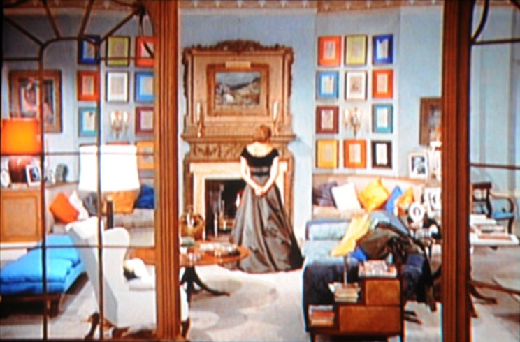
The apartment of Ingrid Bergman in the 1958 film Indiscreet has become a design favorite. I’ve never seen anyone else frame their art so colorfully until yesterday when I came across two examples.
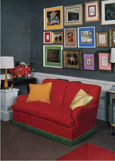
David Hicks also used colorful mats or “picture mounts” as they are called in David Hicks: A Life of Design. This London apartment from 1954 was also featured in House & Garden so I wonder if the set designer from Indiscreet happened to see it.
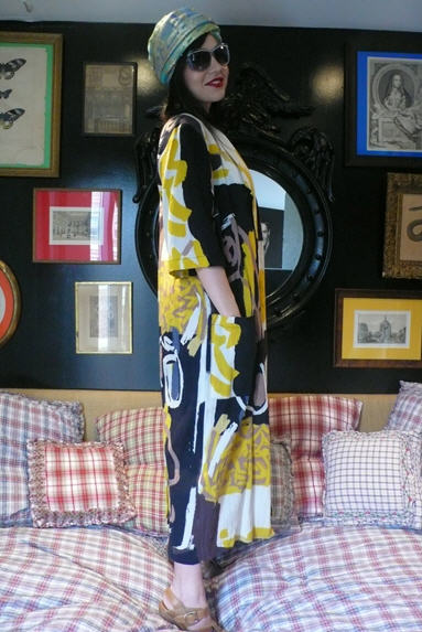
While looking through Tales of Endearment, the blog by Natalie Joos yesterday, I came across a photo of Fabiola Beracasa’s apartment. I love how cheerful the bright colors look on the dark wall.
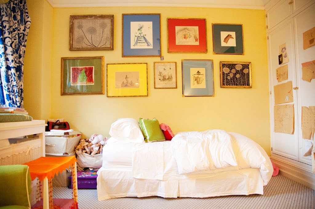
Kate and Andy Spade also hung artwork with colorful mats in their daughter’s room. The craziest color I’ve used for a mat is pale blue so I might have to add this idea to my list of things to try this year!


9 Comments
I love that idea! What a great way to add some colour to a space in an unexpected way.
– xo, Vanessa Elizabeth
I have always loved her apartment in that film! They spend so much time there that it seems like a main character in the movie. I always reference it when playing the “if money were no object” game. Thank you so much for sharing!
Wow!
The craziest colors, as you said! It’s really fun and to be honest I think I would feel happy in a place like that, but to live in a place like that would be too much for me. I think I’d get tired of it.. I think. Guess what? Sometimes we need to take some risks, right? Maybe we all should add some more color in our lives this years… even if it’s not a whole room, maybe we can start slowly, with bright pillows for example or a very juicy red dress or top… something bright!
Heather, do you like Windsor Smith? I’ve posted about her today. So many gorgeous pictures! If you can, drop by and (truly) tell me what you think. It would be such a honor to get a comment from you!
xo
Luciane at HomeBunch.com
I used deep blue silk on two mats to frame out two very large pieces of artwork…love it!
This concept brings in quite a bit of energy. Love it. I think it would, perhaps, be best suited to a limited area. A bathroom, hallway, etc. Thanks for making me think. Mary
Hi Heather-
When I saw the first photo in your post today I knew exactly what it was from. I love old movies and enjoy looking at the interiors with a fine tooth comb. I like the colorful mats, but I love the glass room divider and door in this apartment. How cool to live a room like that.
Heather, This living room is from one of my favorite movies. I have always been a fan of Ingrid Bergman’s and I remember hearing or reading this was the first film she made after the Rossellini break up and the director did everything possible to make this THE perfect movie experience for her. Cary Grant, London, this apartment, her wardrobe, etc. The room was designed by her favorite designer. My mother saw her once when when her daughter was a student at Mills College, where mother was on the faculty. After that mother patterned her wardrobe to look more like IB. She had a folder of pictures of her fashion style and her notes on IB’s homes and exquisite style. Thank you for the memory!!
So very vibrant and bold. I love it….
It reminds me, also, to be daring in design.
Happy Weekend.
You know, I have a pile of things to frame this week, and some of them are just screaming for colored mats but I wasn’t sure if it could be done without looking tacky. I definitely see now that it can! Thanks for the inspiration.