Color My World
by habituallychic
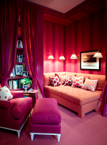
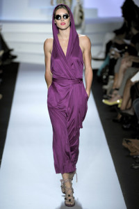
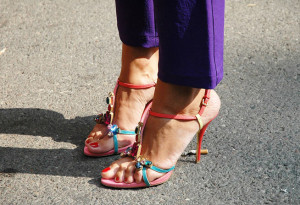
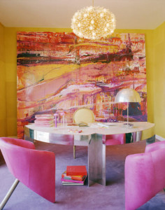
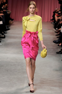
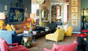
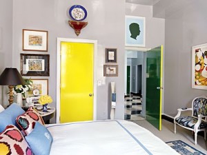
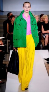
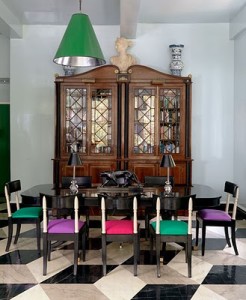
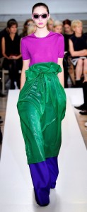
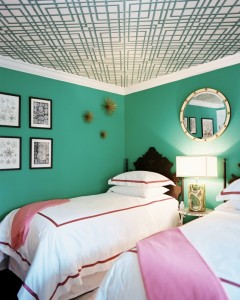
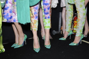
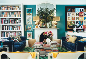
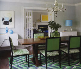
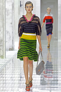
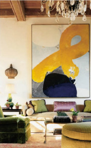
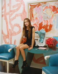
01 . 25 . 11The biggest trend on the Spring/Summer 2011 runways was color. Not just a little color but bright, bold, beautiful hues that will shake up your world. After this brutal winter, I can’t think of anything I want to wear more than cheerful colors. There are many interior designers who embrace color in their work like Jamie Drake (above), Kelly Wearstler and Miles Redd but I wonder if others will start to see the light. Enjoy!
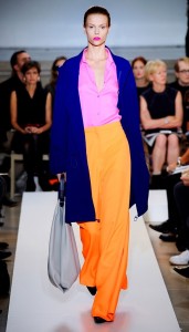
Jil Sander Spring/Summer 2011
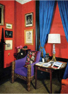
David Hicks, 1954
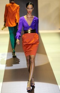
Gucci Spring/Summer 2011
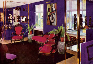
Helena Rubinstein Apartment by David Hicks
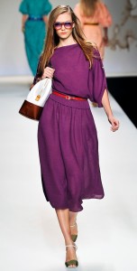
Fendi Spring/Summer 2011
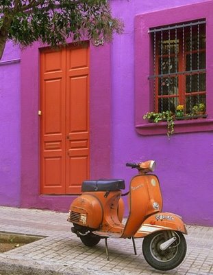
Unknown
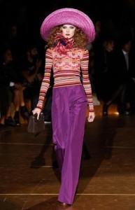
Marc Jacobs Spring/Summer 2011
Photo by Raymond Meier for Vogue
Diane von Furstenberg Spring/Summer 2011
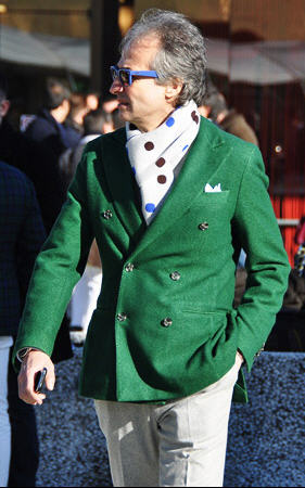
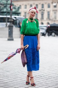
Photo by Tommy Ton
Kelly Wearstler
Nina Ricci Spring/Summer 2011
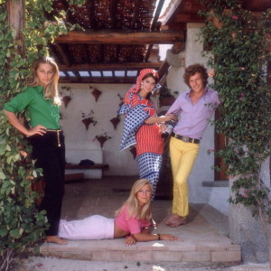
Lord Lichfield and friends by Slim Aarons, 1970
Kelly Wearster
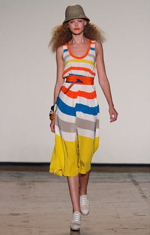
Marc by Marc Jacobs Spring/Summer 2011
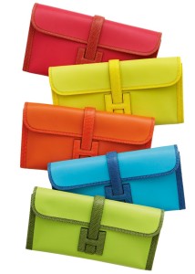
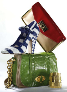
Hermes
Max Mara Spring/Summer 2011
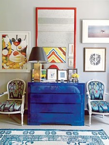
Miles Redd from New York magazine
Jil Sander Spring/Summer 2011
Miles Redd from New York magazine
Jil Sander Spring/Summer 2011
David Cafiero via Lonny magazine
Just Cavalli
Alex Papachristidis
Emily Blunt from January 2011 Harper’s Bazaar UK
Francois Halard for Vogue
Photo by Tommy Ton
Amy Smilovic Home Designed by Shostak Style
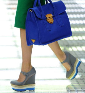
Prada Spring/Summer 2011
Katie Ridder
Harper’s Bazaar
Kelly Wearstler
Prada Spring/Summer 2011
Photo by Vanessa Jackman
Miles Redd from New York magazine
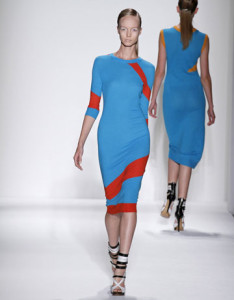
Prabal Gurung Spring/Summer 2011
Kelly Wearstler








27 Comments
I’ve never been a big fan of the color purple, but I think you have me singing another tune… these colorful spaces are pretty fabulous! Thanks for sharing!
abodelove.blogspot.com
The bold colors are just wonderful and they wake up the senses on a bleak winter day with more snow in the forecast!
Fabulous post! I love the progression of photographs!
In the Kelly Wearstler photo, the model is reading Orlando to her children. I have that book – and it is fantastic! My kids are 19 and 21 but I will never give that book away.
Great Post and Pics!!!
lovely!!!
xx
http://www.ilovenystyle.blogspot.com
YES!!! It is what we need now.
I saw your icon on Sharon (my french country homes) blog and the title got me…..I am embracing 2011 as the year for color…and I think it’s about time!!
fun and fresh –
xo+blessings,
Anne Marie
(great picture selections)
This post is really making me happy. Love the Katie Ridder and Kelly Wearstler interiors. It is freeeeeezing in your neighborhood–stay warm. Mary
BEAUTIFUL photos! I just love color…I have to force myself to buy neutrals for my closet & home. 🙂
I’ve always loved using color – I am so over neutrals – and that yellow door just made my day! I’m going to buy a can of paint…
As much as I sometimes think I want a “refined” or “sophisticated” palette, the truth is that I always gravitate toward these bold rooms and designers like Miles Redd and Kelly Wearstler. I just love this happy collection that you’ve put together! I could live inside this post.
This post just makes me happy! A much needed bright and cheerful dose of color on this cold gray day.
Oh, perfect! Sometimes I feel like I’m the only one who doesn’t want light gray walls. I love it in pictures, but in my own real house I crave COLOR!
wow..tons and tons of amazing pictures. I love color! Who wants to be plain jane anyway?
Do you watch color splash with david bromsted?
wish i had the guts to do any of these… just convinced i’d hate it next season like the rest of my wardrobe!
http://www.thislinworthfarmhouse.blogspot.com
Stunning, stunning post so beautiful laid out like this. Oh I want it all and I am so going to reupholster my dining chairs in a bright and breezy colour. Thank you so much for all the eye candy. Have a wonderful week. axx
I will reference this post many times over, so much inspiration.
LOVE love love the post. One of my favorites! You’ve got me with all the color!
I absolutely love COLOR…bold, bright, beautiful color. My licensing partner is always telling me to mute my artwork as it makes the designs more salable. I’m hoping more people begin to “see the light” as you said and I can keep my vibrant vibes in my paintings!
By the way, Heather…I look more forward to reading your daily posts than I do my cup of coffee these days! Thank you for starting my days off on such a great note with your wonderful insights!
I love love love it !!
Heather – Great integration of fashion photos with design examples – a very user friendly way to see how the two relate.
Is it too soon to ask Santa for one of those Hermes wallets ?
LOVE Colors! This post is Perfect to Me!!!!!
http://www.glamthings.com/
OMG my heart is beating faster after looking at all those gorgeous pictures! thank you for sharing.
Heather,
This is an amazing post! I can’t believe how many comparisons you were able to make between the runway and home decor; it must have taken you hours to put this together. Thanks for such a visual treat!!
I dove head first into colour and just painted my living room accent walls BM “Flamingo’s Dream”. I love it, the pink is warm and fun, and it was an easy makeover on a budget. Check it out when you have a chance:
http://bit.ly/hhoIIO
Hi HC, Wonderful colors indeed : ) love your blog ~eL
P.S. the unknown vespa is Barcelona Transport from flickr: http://www.flickr.com/photos/acastellano/92936601/in/set-72057594064241064