Inspiring London Interior
by habituallychic
09 . 28 . 09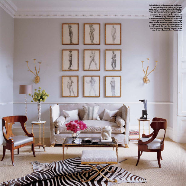 Since I returned from Paris, I’ve been busy and so I just realized that I haven’t posted any interiors. I been focusing on a lot of other things that I have going on right now but decided to go back through my files where I found one of my all time favorite inspiring interiors. I was going to say that the London flat was designed by interior designer Alex Papachristidis but after I looked again at the article from the November 2006 issue of Elle Decor where it appeared, I was reminded that it was really a collaborative effort between Papachristidis and the owner, Fruzsina Keehn, a fabulous jewelry designer. The result is that great mix of styles, periods and pieces that is right up my alley. I especially love the modern 1960’s Italian round table surrounded by 18th-century Swedish side chairs that sits under a 19th-century Venetian chandelier in the entry. It’s full of interesting details that make it look more collected not decorated…my favorite type of design. Enjoy!
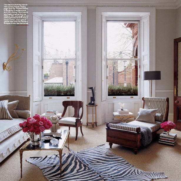

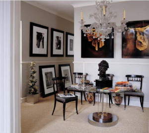
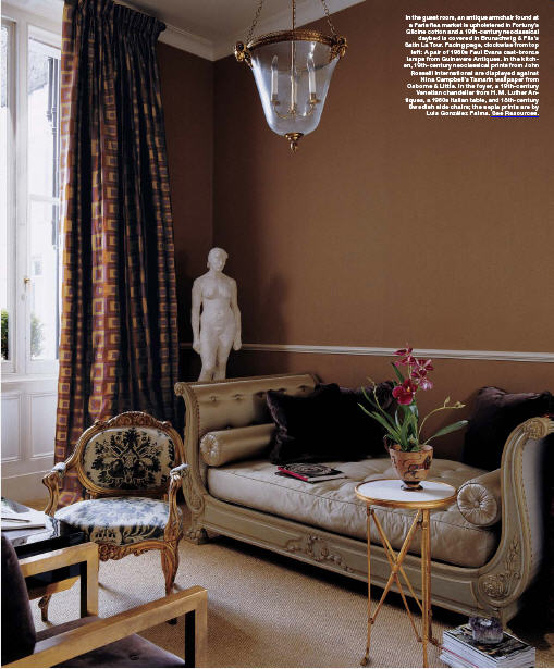
Photos by Simon Upton


30 Comments
pretty.
H-
these are smashing.
xx
Oh my gosh, I still have this issue saved in my house somewhere! I fell in love with the flat and have always found this space to be inspiring. Thank you so much for posting these photos!
Gorgeous. I especially love what appears to be a very formal, yet informal dining room.
xoxo
Rebecca June
This living room is one of my favorites.
This is ALL just so beautiful!!
Beautiful images! This interior is so elegant! I love it!
Greet
Beautiful!
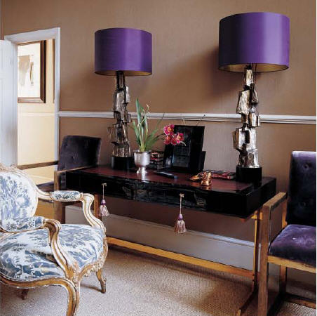
Gorgeous images! Thanks for posting. How fun are those purple shades!
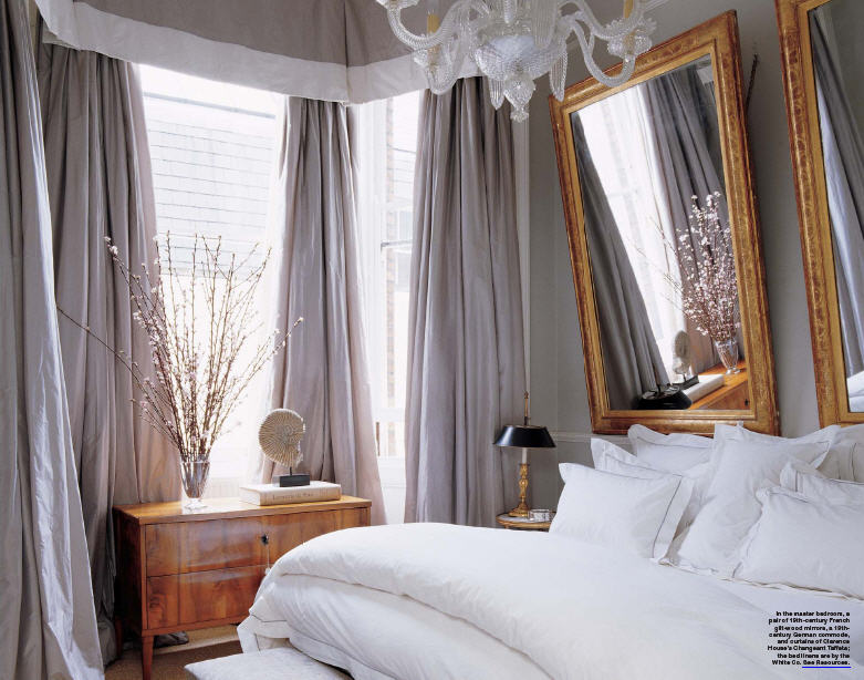
I have loved this since it was first published…I looked at that bedroom every night before bed for months! It makes me want to swap the unused space in the master bedroom for a larger closet/bath area. How much room do you need to sleep anyway?
Good God. Those lamps are out of this world. He is one of my favs.
I am absolutely mad about the use of multiples in works of art and mirrors, love it!
Great flat…wonderful decor, xv.
Heather, these are gorgeous! The art is phenomenal!
London interiors are so divine – there is nothing like them anywhere else! I long to be back in that incomparably elegant country.
Aren’t all interiors collaborations of one sort or another? At least, one hopes so. There must be give and take of ideas and fancies, between client and decorator, otherwise it might as well be a hotel suite. Am just curious about the word “collaboration” and wonder if other readers feel the same?
This is one of my all time favorites. So glad to re-visit it via this post.
xx,
Samantha
Superb! Just emanates London at every turn. That London light is also enchanting and allows for that type of aesthetic to work very very well. Thanks for that, did somehow miss it in ED!
Christian/Maison21 – yes! Very pretty!
Renee- perfect English description!
KT – I love the whole place too!
Rebecca June – I thought it was the dining room too and she might use it as such but it’s actually identified as the entry. It’s my favorite part!
London Calling – mine too! It’s perfect!
Lindsey – glad you like it too!
Greet – It’s elegant but not stuffy which is nice.
Dagny – glad you think so too!
Laura Casey – I LOVE the purple shades and the modern bases! So unexpected!
EAC – The mirrors above the bed make me a little nervous but it’s very chic!
Jan West – I will have to check and see if there is a source given. They are fabulous!
Tina – You can usually find multiples that aren’t too expensive in a book and have them framed so it can be a good DIY project.
Vicki – I agree!
Karena – I think art is so important to a great finished home. It really makes a difference.
An Aesthete’s Lament – There are definitely clients who are too busy and too wealthy to be bothered with their interior design and let the designer choose everything. I think we are finding that less so today where homeowners are more informed and do online research and want to be a part of the process. The article clearly stated that they worked together which is why I used the word collaboration. It wasn’t the point of the post, the gorgeous photos were the point.
Samantha – I have been meaning to post this for a year so I’m glad I finally did. I still love it after all thses years. I hear the owner no longer lives there so I wonder what her new home looks like now!
Gaj – I think all European interiors are fabulous. I think it is the windows and the light. They are so much larger than those used in America. Always makes me want to move!
Every room has great style…I love those long windows in the main living room…very European. I wish more homes in the US had those amazing windows.
Jen Ramos
‘Cards & Prints You’ll Love…’
http://www.madebygirl.com
madebygirl.blogspot.com
They are pretty designs except for the flying carpets in the middle of the rooms, which command too much attention, (in my opinion). I think the floor should blend, not standout.
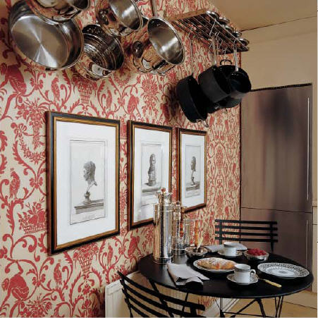
Wow, that kitchen with the wall paper, the pot racks and the cafe table are simply breathtaking – wow – that is some clever work right there. I am trying to catch my breath here…..I love it so much.
Thank you for reminding me of this spread. I do remember when it was published ( I know at least parts of it are somewhere in my reference files).
I’m having a hard time finding anything wrong with it, or that I would change.
Superb!
David @ Ashfield Hansen
SO beautiful! The bed looks so cozy. I also love how the mirrors are purposely tilted.
This is simply amazing. What a wonderfully executed total design. The lamps with the purple shades are exquisite and the nudes in the first picture are fabulous. Thanks for the post!
Hi Heather this is refreshingly beautifully perfect!
Thanks for posting!
oh wow… i can’t breathe, it’s all to gorgeous!!!! that last photo is stunning. love the paint choices too…
These interiors are stunning. They are so classy and elegant. Makes me want to hop on a plane to London right now!
great interior…LOVE the purple lampshades. YES!
That kitchen is fantastic. Colorful, unexpected, and striking. I’m actually surprised you don’t see strong patterns like this in kitchens more. By nature they are filled with so many strong shapes, and as such a strong print could be balanced, rather than overwhelming in the kitchen. Your thoughts?