Amanda Nisbet’s Chic and Colorful Apartment
by habituallychic
05 . 03 . 09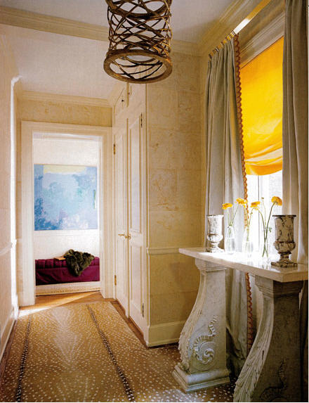 The best part of Friday evening was peeking into Amanda Nisbet‘s chic apartment! It was beautiful and elegant as well as colorful and comfortable. Not an easy combination yet it was perfect! Amanda teased me most of the not about not liking color which I assured her was untrue. I just haven’t had an opportunity to use a lot of color so far. But I have a new large project on the Upper West Side that I have started and Amanda’s apartment is going to be a big inspiration for it! And who knows, maybe someday, thanks to Amanda, I will be known for color too! Although, I think we should start with baby steps!
Amanda offered to let me come back and see her office which is across the hall. The night of the party it was acting as a storage space for a few things from the apartment. I teased her that I hide things in the bathtub while Amanda can hide things in her office which she joked was her big bathtub! I hope she will let me take a few more photos of her apartment on that visit since there are many details that you can’t see in these photos and some things have changed. Just like any great decorator, Amanda is known for moving things.
The entry above is still the same but for the party the urns on the 19th-century marble pier table were filled with beautiful lavender flowers. The carpet is Antelope from Stark and the light fixture is by Hervé van der Straeten available through Ralph Pucci in New York. The aubergine silk tufted bench at the end is perfect for sitting your bag while you hang up your coat too.
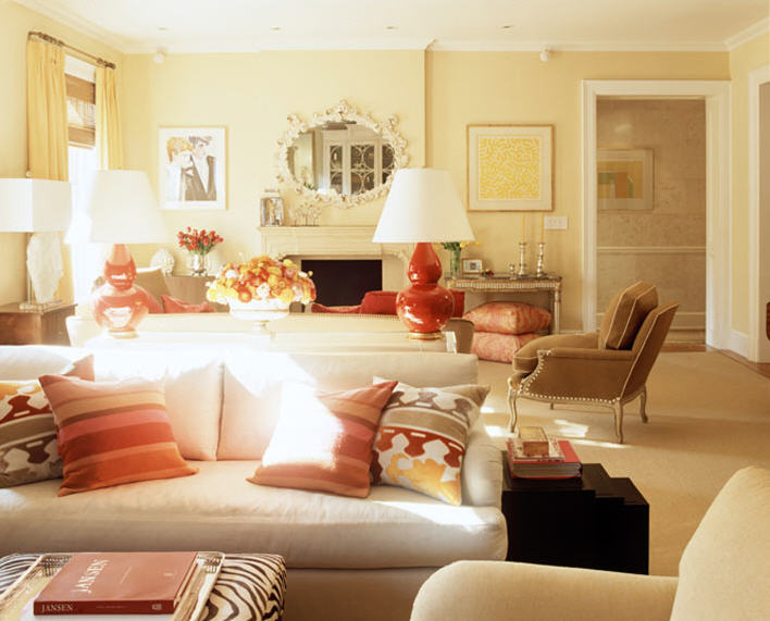
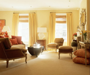 The colors also look a little different in real life or maybe it was because the party was held at night and these photos were taken in the daylight. In the March 2008 issue of House Beautiful, Amanda mentions that the living room “is best at night…with the stick blinds closed.” In reality the room is less yellow since the walls are Benjamin Moore Desert Tan (2153-50) and the curtains are burnt orange. I think the reason that I love Amanda’s apartment is because you’ll notice almost all the rooms have neutral walls and carpeting. The color comes in the form of curtains, pillows, upholstery and art. A neutral backdrop is great because then you can change out the pillows and other smaller items whenever the mood strikes which is cheaper than repainting or buying new carpet.
 The living room is divided into two zones by back to back sofas. The television is actually housed in the ginormous William Yeoward Cherington bookcase that Amanda had shipped from the UK. Obviously ceilings there are taller so the middle three finials had to be removed. The lamps are Christopher Spitzmiller.
 As I mentioned, Amanda likes to rearrange and the beautiful Elizabeth Peyton has been moved to another wall. I mentioned in my last post that Amanda has an art history degree but she also worked for Christies and has an enviable art collection. If I didn’t like her so much, I could easily hate her for all the amazing works in her apartment!
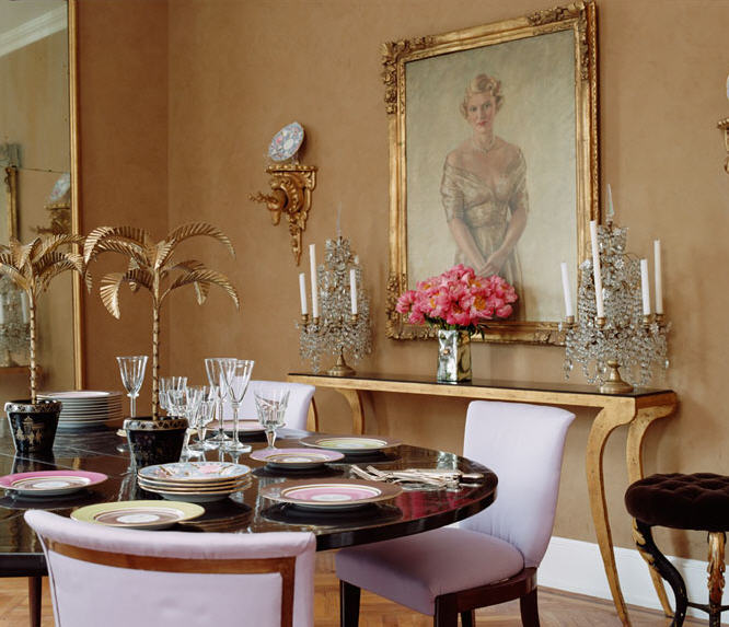 One of my favorite rooms was the glamorous dining room. The brown Venetian plaster walls are so beautiful with all the gilt and lavender upholstered chairs. I’m not sure if the portrait is of Amanda’s grandmother so I’ll have to check but many of the items in it are from her including the bibelots and china on the table below. In this photo of the dining room, the table is about to be set with china from Marie Daâge. I’ve been in love with Haviland’s Laque de Chine china in amethyst and gold forever and it would also look pretty in this room.
 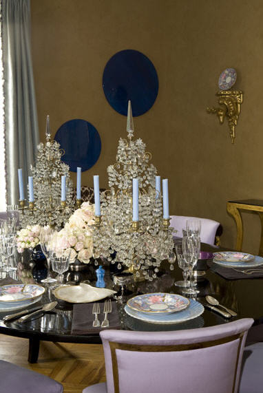 Isn’t that most beautiful table you have ever seen?! I love how the blue candles pick up the color of the plates and also the draperies.
 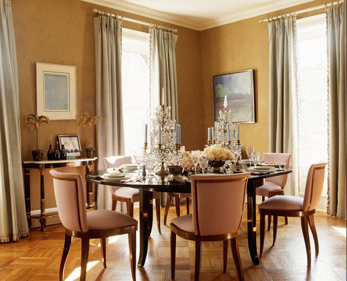 The color is a little off in this photo but the curtains are a pale blue. Since this photo was taken, a to die for bright blue and white painting by James Nares has been installed above the demilune table. If I can’t own my own James Nares, I’m glad I can admire Amanda’s!
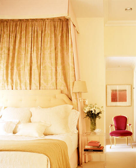
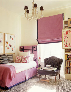 Apparently, Amanda found out too late that her daughter wasn’t fond of lavender since the room was decorated while she was at school. Oops. It’s actually really subtle since the walls are white. I really love the Greek Key rug which is Beaton by Stark and relates to the pattern on the headboard. The fabric on the headboard and shade is Montego Tourmaline by Manuel Canovas. The navy blue patent leather chair is really fun too!
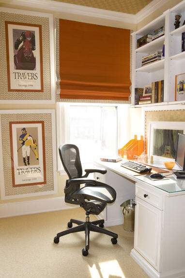
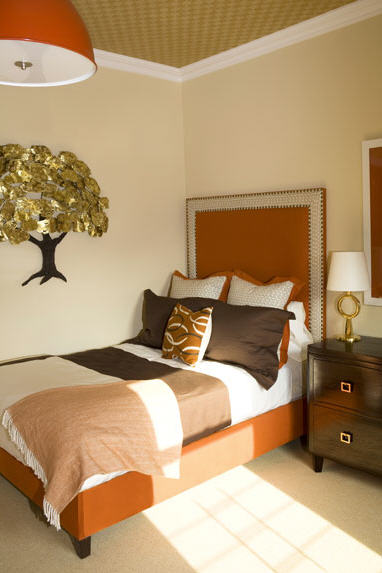 Everyone really loved the son’s room. I especially like how the orange in his room relates back to the living room and the lavender in the daughter’s room relates to the dining room. She even papered the ceiling in a wonderful patterned paper. When Caroline Rhea was in this room with me and Christopher Corcoran, I asked her if the children appreciate how fabulous their rooms are and she said that they definitely do!
 I really like children’s rooms that aren’t too childish and can grow with them. It also works well if you ever have to use them as additional sleeping quarters for guests too. No adult wants to try to sleep in a bunk bed or race car. Trust me. The children share an adjoining bathroom that I don’t have a photo of but that has a great green and white herringbone wallpaper. I would think it would be very cheerful to stumble into in the morning while getting ready for school.
 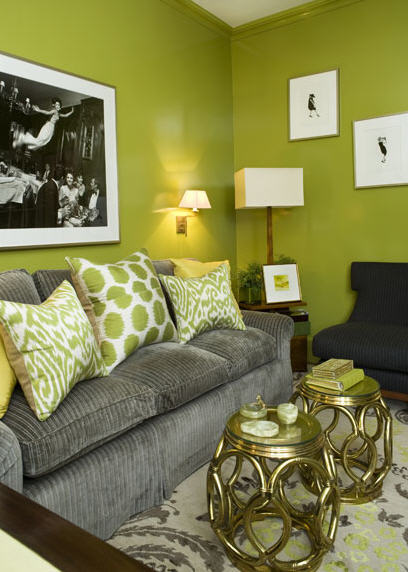 Another one of my favorite rooms is the glossy media room! The walls are painted with a glossy paint from Fine Paints of Europe the color name I do not know but I will find out. I have said before but I love lacquer and shiny walls in New York apartments since they tend to be small and dark and the paint is great for reflecting light. I love how she’s mixed in brass and black and photos in this room too. On the opposite wall is a built in for books and the television.
 A coordinating tablescape in the media room.
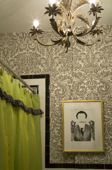 I’ve already mentioned how many of the rooms relate and the hall bathroom is across from the green media room so the green shower curtain works perfectly. I love the whimsical picture and notice how it is hung over the bump out in the wall. New York apartments are notorious for strange bump outs and I love how she didn’t let it deter her from hanging art above the toilet.
 The pink bedroom reminded me of Charlotte Moss‘s room at the Kips Bay Show House this year who’s fictional husband said no pink in the bedroom! Amanda’s husband asked her that since they had so many pink bedrooms over the years could she maybe she could go with a different color this time. I guess she tried but kept coming back to pink. In reality, it’s not really that pink. The walls are Farrow and Ball Tallow, a very creamy white and the carpet is also creamy white Berber. The room is really dreamy and makes me think of floating on a cloud. The hot pink chair in the background has been replaced by a gorgeous grey shagreen piece. I also love how the the lucite nightstand disappears.
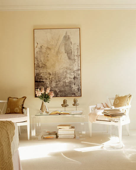 The new grey shagreen piece relates well to this painting Maury River Cliffs by Ray Kass in the sitting area. The lucite table keeps the arrangement from looking too heavy as well.
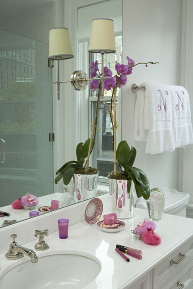 Amanda’s husband was very glad that there was no pink in the bathroom but that was before the wallpaper was installed above the tub (below)! He’s ok with it now because he can’t see it from the shower! Pink is a very good for your complexion so I bet it’s nice to put on make up in this bathroom! I think it’s funny that Amanda teased me for hating color because I really do like it and especially in her apartment! But I’ll still let her take credit for converting me! But only if I can come over and visit her art!
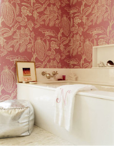
Photos by Pieter Estersohn for House Beautiful and Amanda Nisbet Design


21 Comments
Absolutely stunning. That green glossy paint has me drooling. What a beautiful apartment!
Simply gorgeous and elegant!
The chandelier in the first picture is amazing! Each photograph has something unique to show. Great entry!
Beautiful and inspirational post. I love getting to see NYC apartments as the space is so different than homes in Atlanta, where there are lots of windows and often the rooms are quite big.
I was particularly interested to see the dining room space. I wonder how big it is? It seems like all of the dining room pictures in my files are large dining rooms, and I am trying to find more pictures of intimate size dining rooms to see how they are handled. It looks like Amanda did not use much heavy furniture along the sides of the room, and she picked a round table for the space.
Great post!
Is that not the most glamorous apartment EVER? What a great place for a party! Sounds like you had a great time, can’t wait to see the office!
Her apartment is absolutely gorgeous and I have to say that I am completely jealous of the daughters room. I love that navy patent chair and wish I had one just like it now!
xoxo
Rebecca June
Great pictures of a faboulous place. The description made me feel like I was there too.
Oh my gosh..all these fabulous rooms in one apartment? I have the daughter’s room saved in my files but loved seeing the rest of the apartment..thank you.
So utterly fabulous! What a great talent, so beautiful, every room so unique but it all works together.
What a fabulous apartment!
Do you know if the border on her daughter’s roman shade is made out of ribbon or fabric?
Thanks for a great post!
I’m in heaven over her apartment… the coral color lamps pop in the living room, I’m looking to find wall paper just like in the bathroom and the framing job on the posters in the sons room was incredible. I printed that pic off for my style-file. I studied framing for 2 years in Paris and so am always intrigued by good matting and that was top!
Thanks as always for another excellent post!
Toma
I know that you will get many requests for things in this post, but I would love to know who makes the green and white herringbone wallpaper (and pattern name if possible), I have a green bedroom and need wallpaper for the ajoining bathroom…Thanks a million!
Absolutely lovely. The colors are just incredible. Thank you for sharing this, you provided me with countless decorating ideas for my own home. Wow, do I envy you for being invited to dinner! Hope you had a wonderful time 😉
It really is the perfect amount of color for we neutralphiles. The result is very sophisticated. And I love the “backstory” behind all the decor. : )
I’m moving in–I want her maid also. Beautiful home, it feels so good. The marble console is amazing–fragments from a 19th c. fire surround turned upside down! Those colors are perfect.
Thank you, Heather.
The Stamford Wife – I know! That room is divine! I might steal that color for my new project.
Natasha – I agree! So glad you like it!
Meade Design Group – I love Herve van der Straeten! It’s such an interesting choice and so perfect!
Things that Inspire – I’m not sure of the exact size but it might be about 10′ x 15′. The lavender chairs were really beautiful in person! I loved that room! I can ask her more about when I see her tomorrow!
Stefan/Architect Design – it is so glamorous and fabulous! But yet comfortable and family friendly!
Rebecca June – I’ve seen black patent chairs but navy is so chic! I’m jealous too!
Brillante Home Design – thanks! I’m so glad you were transported to New York for a minute 😉
Blue Hydrangea – so glad i could introduce you to the rest of the apartment! The daughter’s room is so perfect!
A Gift Wrapped Life – I know! I was thinking that if you showed someone all those rooms separately, they would never think they all went together but they work so well! It’s amazing!
Anonymous – it’s navy blue cotton tape but you could probably do something similar with a dewn on ribbon border.
The Antiques Diva – which bathroom? The poweder room is Farrow and Ball and the master bath is an overscale Manuel Canovas paper but they don’t give the name. I love those frames too!
Cynthia – I never thought anyone would ask for something I didn’t even show in a photo! Lol! The children’s bath paper is Greta natural herringbone in Apple from Studio E available from Koroseal in NYC, http://www.studioeinc.com/. They don’t have the photo online yet but if you call they will probably help you.
Tealle – it was cocktails and not dinner if that makes you feel any better 😉
Brilliant Asylum – the stories are the best part!
Mary – good call on the maid! She was helping out the night of the party! That console is even more amazing in person too!
Looks like a wonderful place for a party! Sounds like you had a wonderful time. Living in NYC certainly has it’s advantages!!!!!
Thanks for the info on the wallpaper, Heather! I always love getting new sources, and I have a thing for herringbone!
Very cheery place. Bright and cheery.
Love the kids rooms- so bright and cheerful.
Sooo gorgeous and definately inspiring!