2009 Kips Bay Show House Designer: Kathy Abbott
by habituallychic
04 . 21 . 09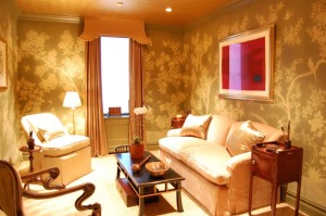 I feel like I could say that every room in this year’s Kips Bay Decorator Show House is my favorite but I really did find something to love about all of them! One of the most sophisticated and elegant rooms this year is the library created by interior designer Kathy Abbott. On the surface, it’s a gorgeous and serene room but after talking with Kathy I realized how much work went into creating a space that looks this perfect.
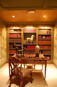 Her space began as three small rooms with two doors and an unsightly air duct that she was able to rework into one long room with a single entry. She covered the air duct with wonderful wood paneling and another problem area with built-in book shelves that look as through they have always been there!
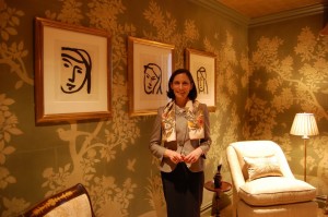 As I’ve mentioned before, it’s the stories behind the rooms that makes me appreciate them that much more and I really enjoyed chatting with Kathy about design and blogs! I can attest that she is as lovely and elegant as her room!
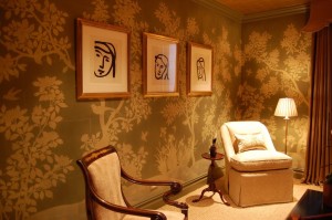
 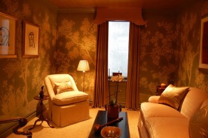 This room is a bit dark since it only has one small window so Kathy decided to work with what she had instead of trying to fight it. The custom Gracie wallpaper and Asian accents create a little jewel box that makes it look the perfect place to get away from the television and computer and curl up with a good book! Kathy knew she wanted a silhouette patterned paper since it has a bit of a younger feel and the gold tea leaf paper helps reflect what little light is in the room. I usually don’t respond to traditional design but I think this room strikes a perfect balance of not being too masculine or feminine or too cluttered. In fact, I’d say it’s pretty darn near perfect!


10 Comments
I thought the ceiling in this room was the perfect touch, and I did not notice the three head sketches until seeing your pictures. It was a beautiful room.
This is a very lovely room. Agree about the ceiling. It’s great getting these sneak peeks at the rooms.
love the chinoiserie walls and the feel of the room…
I love the Gracie wallpaper and chinoiserie touches without being overdone-lovely.
Love the room. Where are the lamps? I see only one floor lamp.
I love the ceiling. I am so tried of the “fifth” wall being white, white, white. Love the bookcase and the pelmet over the window. Artfully done and done as art.
I am from the suburbs of NYC and I always get into see this showhouse.
I went there today and liked this room as well as the other two on this floor. The other floors were good too, specifically the second floor. Every room on that floor especially the beautiful Landing was unique. Many of the designer’s were careful with their spaces and some really nice touches were used.
I agree…”Perfection”. I love that she did not fight the lack of light in the space and made the lack of light wonderful.
Very nice – I really enjoyed this – especially the wallpaper!!
funny – once you tell her story you realize what a terrible piece of interior real estate she had to work with. quite the accomplishment to turn those liabilities into assets. nice detective work, heather! 😉