Going Gray
by habituallychic
03 . 18 . 09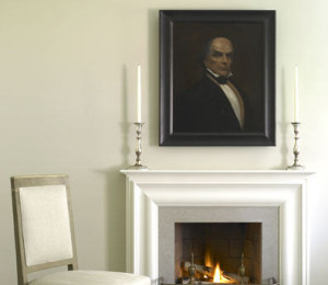 I was going through some old magazines recently and came across a Martha Stewart Living magazine from September 2005 that was a special decorating issue. In it was the gray apartment of the Martha Stewart Living creative director Eric Pike. It’s very serene and calm looks very Martha. Since it was a gut renovation, space was created for Eric’s collections, also very Martha. I wonder if the home has since been cluttered up with books and more collections or if it’s still clean and clear. I would have definitely messed it by now! But it’s still nice to look at. Enjoy!
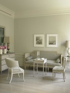

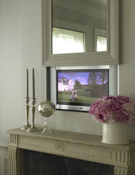
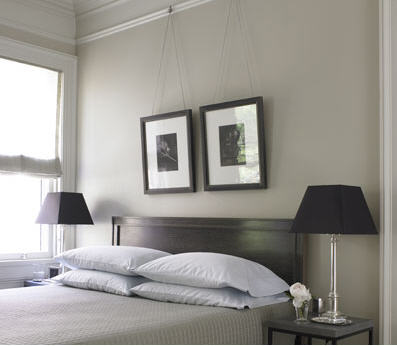
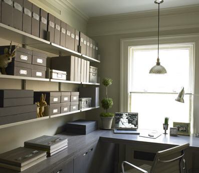
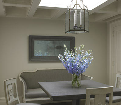
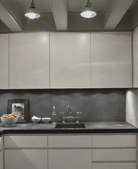
Photos by William Abranowicz

36 Comments
I remember seeing this apartment and just flipping out with how beautiful it was. I could move right in!
LOVE LOVE LOVE it!
It is a very beautiful apartment but maybe a touch more clutter wouldn’t hurt. although it must be calming living in a home like that, xv.
meow. it still looks so good. clean, crisp, classic yet current. I especially love the office space.
Pale grey is so chic. I’ve used it for carpets and walls in my house in a bid to create what I’m pleased to call the Christian Dior salon look. Needless to say, I haven’t got further than main street on my budget!
I am evangelical about a Dulux paint (I’m in the UK) called Khaki Mist 5. As the name implies, its root is warm and it goes anywhere with subtle distinction!!
I would have added pieces by now. I adore that office space and saved it for reference. Thanks
Ness xx
Thank you for the beautiful reminder! What an exquisite apartment… you couldn’t have posted this at a more perfect time!
-Thanks!!!
I think Gray is definitely the new beige but with just more color and character. This home is very serene as you said.
I don’t live like this, but I do love this.
beautiful. indeed. but so not a realistic environment to me. i mean, i have a 4 year old. where would all her horrible looking pastic shit go? for that matter who DOES live here?
Very well designed rooms with beautiful furnishings, but too sterile for my taste. Reminds me a bit of the creepy dream sequences in 2001: A Space Odyssey. Hits of color please!
I have this apt in my clipping files, it’s this issue that got me to get a martha stewart living subscription!
I would have junked it up by now too ~ Very beautiful and calming though.
I don’t know if Martha Stewart would be considered a designer or a conceptualist or a stylist, but I always really loved her spaces, her use of color, her colors, her coordination of colors, her choices in furniture, everything. It’s always so serene and peaceful and isn’t is nice when your own house can be a refuge from the real world outside your house. She really is a classic.
Beautiful. The grey is incredibly elegant.
What a serene & beautiful collection! Not a color I use much..but I think I should!
Thanks for the calming post!
Stacey~
I remember this layout clearly. One or two pages into it I was loving it, but by the end I just found it sad and depressing.
Gray is wonderful, but the ENTIRE APARTMENT? The kitchen in particular was just sad. I think I would eat out a lot if I had to cook in it.
I had no problem with the design, but the palette is just such a downer. I agree with the comment that gray is the new beige. The apartment would be a perfect canvas for pops of color via art or textiles.
I do like gray and I’m glad it is gaining more popularity- however- I have to say I’m not that impressed with this monotone gray apartment. It needs something more- more color or more depth- it just reminds me of a really boring office or hospital. It doesn’t seem elegant to me, more like a sanitized doctor’s office.
HC –
A little too sterile for my taste – but I understand it. Thanks for a calming effort on a crazy green day.
okay
So fresh! Classic style never goes out of fashion. Thank you so much for revisiting this inspiration.
so, so pretty. but what happens if you wake up one day and hate gray??
YUM! I painted the walls of my house the most perfect shade of gray and it makes all of the mouldings just POP!
It is beautiful, very chic, very serene (and very Martha, as you said) but unlike most other ‘decorated’ spaces – it looks to me as if nobody lives here. A tad of color, just a leetle bit of somethin’somethin’ – I dunno – just something to give it a touch of ‘home’
I do hope it’s been lived-in a bit since it was photographed. It is beautiful, very Vermeer in its lighting, et cetera, but needs more life!
This apartment looks a bit like a conceptual art piece to me- haute couture that is a very interesting theory but I could never imagine transferring directly into my life! I’m a color girl… though I am doing a grey gallery wall in my living room stairway and am having an unbelievably difficult time finding a neutral silvery grey that is neither lilac nor mauve… in that light I’m quite impressed with all the tones they found to work together!
Thanks everyone for the great comments! I have been busy styling a photo shoot today so I don’t have time to address each of you personally but I had a feeling this apartment would be a bit controversial. I think that even if it’s not how you would live, there are some great aspects to take away and it would also be the perfect backdrop for those who would prefer more color. There is no right or wrong in interior design since each space is so personal to the owner.
Any idea which paint they used for the walls? Or recs on ones that would have a similar effect? Thanks!
It’s so clean!!!! My family would take care of that in a New York minute! Very pretty.
i like it, I just think it would look 10x better with hints of color here and there. It’s a bit to museum-ish for me as it is. In theory I like the idea, its just that in pratice its so much grey that its kind of bland. For example, how much more stunning would that couch and those photographs look offset by a beautiful blue wall. I’d love to see another feature of the space now, if it has changed at all.
alex @
fromaloft.blogspot.com
I’m so in love with this apartment. I painted my hardwood floors Pigeon Grey and the walls White Diamond this past weekend! So wonderful to see this and feel like I made the right choice! My home has never felt more spacious and luxurious, its so soothing. Thanks for the validation!!
Wow, so loving this! Thank you.
loved this when first published (actually bought that issue of martha ‘cuz i glimpsed the spread while browsing in the check out line, and love seeing it again now.
like many posters have already commented, i can appreciate the apartment for it’s serene, minimalist beauty, and i’d relish the opportunity to create such a rigorously edited environment for a client, but could never live that way myself- i lurves my tchotchkes waaaay too much to be a minimalist!
I too remember this and while reading it suddenly started to shiver…..it’s just so cold. Don’t get me wrong, I love a decorated space as much as the next guy, but this is not liveable.
Where do you sit? It was clearly done for the editorial. I suspect Eric Pike has a really messy, Martha-ish, cluttered country house there one can really relax, sit on the furniture and not worry about destroying the symmetry.
It is SUPER clean…I like it alot. But I would need some color or I;d lose it.
Jen Ramos
‘Cards & Prints You’ll Love…’
http://www.madebygirl.com
madebygirl.blogspot.com
I literally gasped when I saw the flat screen behind the mirror – fabulous!
Angela Fields
http://chictobe.blogspot.com
Beautiful apartment!
I love the the sliding mirror over the TV. I am going to try that. Has anyone done this before?