Stephen Shubel Design
by habituallychic
01 . 19 . 09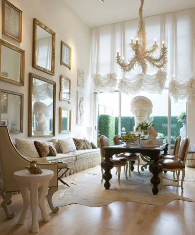 It’s funny sometimes how you may see certain designs and not realize they are by the same person. I remember seeing the Stephen Shubel Design office, seen here, in the May 2008 issue of Domino magazine and loving it’s neutral colors, classical statues and French feeling. So I was surprised to see that Stephen uses more color in his designs for clients as seen in the January 2009 issue of House Beautiful but sometimes those who work with color and pattern all day like to have a neutral backdrop. Whatever the case, I could see being very happy working or living in this beautiful space!
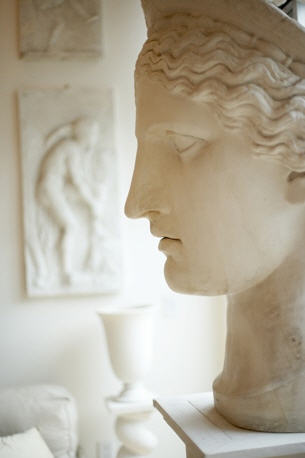


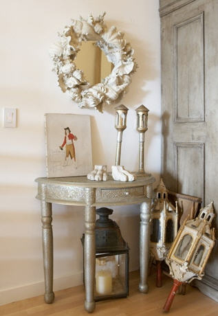
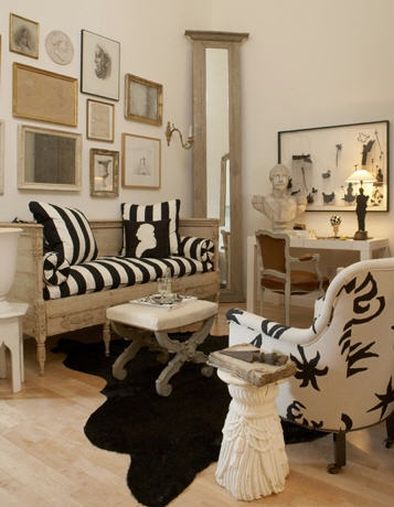
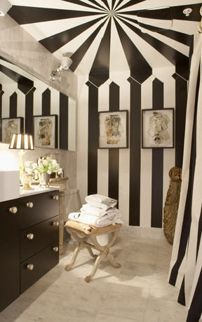

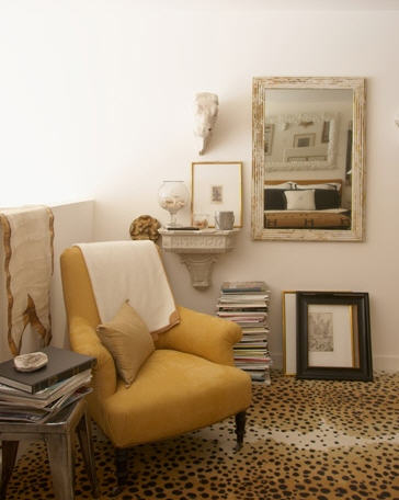


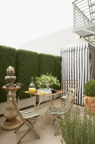
Photos by Philip Harvey via Stephen Shubel Design


15 Comments
I agree, beautifully decorated, and I like the neoclassical statutory and other references, the black and white – beautiful indeed!
hello! I have to say I love black and white and especially tiny framed drawings!
Hm, it’s a little too colorless for me but I love the carpet in the bedroom. And I’m not a carpet person. It is a beautiful space though, even if it’s not my personal preference.
Gorgeous, ethereal ! This is where I want to live in my next life. Where is this divine space ?
This breatahtaking – where is it? It takes some discipline to create such a neutral but visually dramatic and textural palette. I would be so tempted tot hrow in some bright color : )
I’m going to look him up right now – thanks HC for a great post!
I agree, this is a really beautiful office (that I have in my clipping files!) I never noticed that framed B&W photo of the pavilion at versailles – stunning!!
I was just thinking of those faux, fabulous boxwoods the other day! Thanks for reminding me where they came from. Terrific post Heather!
I think it’s perfection.. I too adore color.. but can see how working daily with different colors and patterns could somewhat feel like a whirlwind.. I am sure the neutral colors are his shelter from the “storm”
I’m in heaven over this posting… and found myself googling any images I could find by Stephen Shubel Design after reading/viewing this post. My personal style is very similiar – very graphic, but I almost always add a burst of red or yellow depending on the room to juxtapose with the black & white!
Your postings as of late have been SPOT ON! I find myself anticipating opening your emails. Keep up the good work.
Toma, Aka, The Antiques Diva
It’s really amazing what one can do with all basic colors. Just lovely.
I love Stephen’s style…I also remember being fascinated by those fake hedges he has on his patio – what a great privacy option for the city!
love it!
Wonderful post, Heather!!
i agree with annechovie- those fake hedges are pretty brilliant!
I love cabanas…would love to have a space for one!